Creative Ads That Try To Convince Us To Buy Things We Probably Don’t Need
Advertising, as we are well aware, is a marketing strategy aimed at catching the audience’s attention and piquing their interest enough to get whatever it is that is being advertised. The key to an effective ad is creativity. Most people have a short attention span and lose interest in things quickly, so boring ads hardly hold the attention of the audience. In light of this information, different brands have been trying to come up with more exciting and creative ideas for their marketing. How creative is creative? In this article, we’ll be looking at some advertisements that have taken their marketing strategies out of the box and to a whole new level. We’ll show you 45 Ads that have caught our attention and stand out from the crowd.
This children’s hairdresser knows how to get attention
This advert was orchestrated by Cuttie Cut, a hairstylist for children. Cutie Cut saw the need to step up their advertisement game, so they came up with the perfect way to do it. This method of advertising plays on the curiosity of the audience.
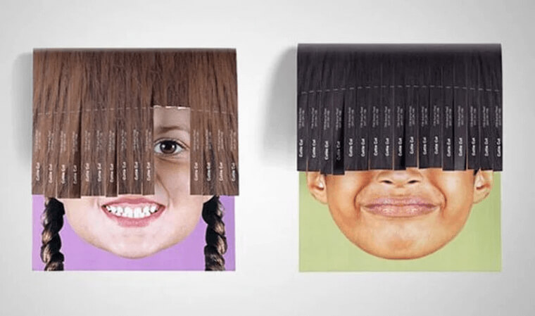
Cuttie cut made use of tear-off ads, but that’s not where the genius of the advertisement stops. We mentioned that it plays on the curiosity of the audience. How? They put the pictures of cute kids under the tear-offs, so tearing off the advert reveals more of the child’s face.
Billboard creativity
In our list of hilarious advertisements, this has to be one of the top-listers. This advert will get anybody’s attention because the creativity level is out of the box. The advert is so practical and straightforward that it can’t not catch your eye.
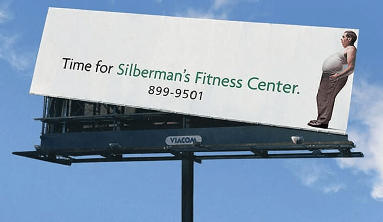
This advert is for the Silberman’s Fitness Center, and it depicts a man in need of a workout, causing a displacement in the billboard to his side. There is hardly any other billboard that can beat this one in terms of practicality and creativity.
Creative Starbucks Cups that will leave you wondering
Talk about a great way to boost sales. Starbucks has come with one of the most creative ways to advertise its products and get more people to recognize them. You might be wondering, isn’t it just coffee? Well, wait until you see the cup.
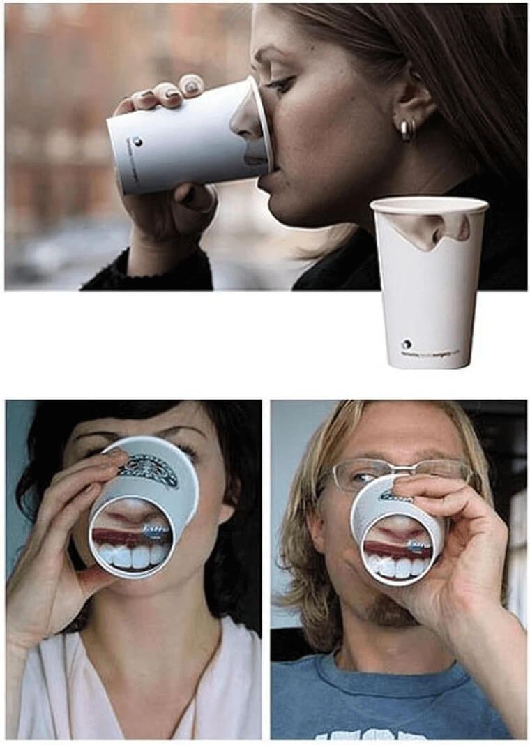
Starbucks has come up with an effective way to advertise while saving costs at the same time. The Starbucks cups have images printed on them of parts of the body like the nose, and some even have teeth at the bottom. These cups are suitable for pulling pranks on those around you.
Pints or Binoculars
Have you heard of Pub Finder? This company is exactly as the name depicts. It helps people find the best pubs in their area. With the name of the company in mind, you can see how their advert is eye-catching and effective.
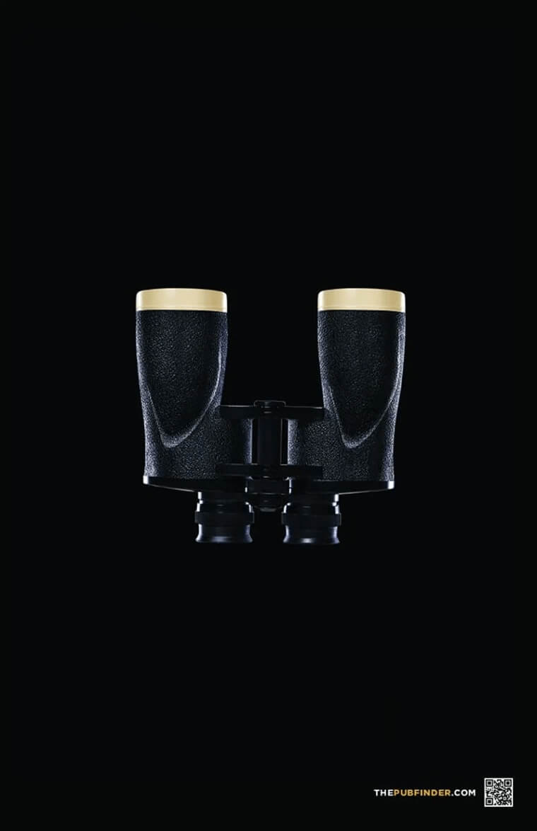
The name of the company is The Pub Finder, and if you take a look at their ad, you will see it shows a pair of binoculars. Except, they are not your regular pair of binoculars. They have pints instead of focal lenses. This is a pretty imaginative advert.
Enjoy the dark
While most companies try to use simple, people-friendly, and safe adverts, this one has taken an extra step and done something that is rarely used; dark humor. While dark humor might be considered normal to use in some cases, you would never expect to see it on a KitKat ad.
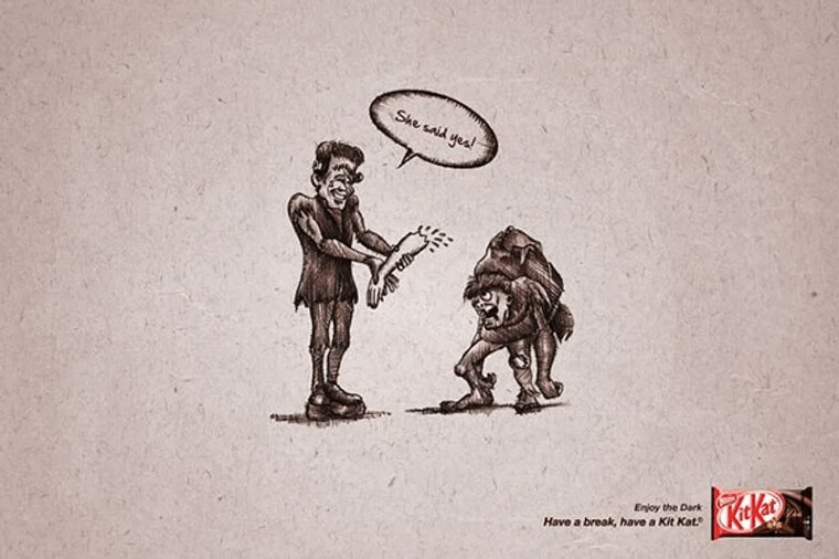
The advert shows the picture of Frankenstein or his look-alike holding an arm out to his buddy with the caption “she said yes.” This is just a representation of what goes on in the dark, and that is Frankenstein enjoying it.
Something for the Geeks
This one is supposed to be coded, but it is still relatively simple enough for all of us to understand. Axe, who is a body spray production company, came up with this. This advert has an element of geekiness in it.

The element of geekiness is because of the format that the advert uses to pass across the message, “if you understand this get a girlfriend.” The way the message is written indicates that it is a code. It’s quite ‘”genius.”
Evil Carrot’s Revenge
La Dispensa is a food processing industry, and they are responsible for the manufacture of various soup flavors. Their different soup flavors are represented by evil characters, and each flavor of soup has its own evil character they portray in their ads.
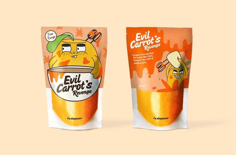
The evil carrot is one of our favorite characters. The package of this soup has a cute but evil-looking carrot in it. The image printed in front shows a mixer stuck in the head of the carrot, while the back shows an image of the carrot getting naughty with the mixer.
Ambi Pur Pour Lavatory
This advert is one of the most hilarious ones we’ve come across, not because the content or image portrayed is funny. Still, the relevance of it to the product being advertised makes for a very humorous experience, to say the least.
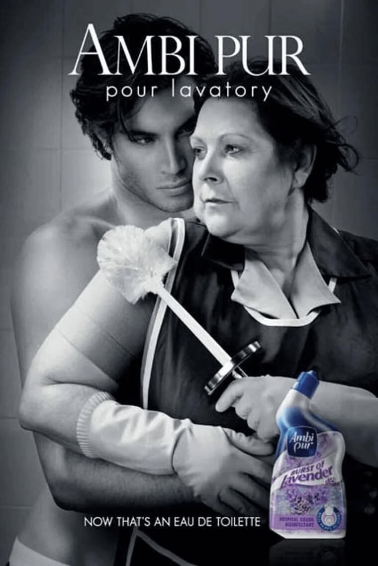
Ambi Pur Pour lavatory is a cleaning product company, so you would expect that the advert would be set in a bathroom or show how effective the product is. However, this advert takes things to another level and brings in “sexy” into the advert. You can see this from the image of the “sexy man” hugging the cleaning lady.
The Worst Hotel In The World
Talk about confidence and giving the audience what they never see coming. This advertisement is one that ignited a spark in the world of advertising. Amsterdam’s Hans Brinker Budget Hotel is responsible for making this eye-catching ad that stands out from the rest.
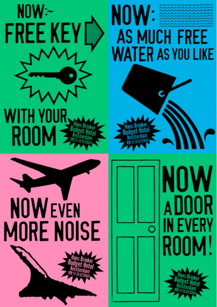
This hotel was rated as the worst hotel, and they couldn’t even get any rating online, not even one star. After this rating was released, the hotel did something that the audience never saw coming; they included all the bad reviews into their advert and advertised them instead.
You should get an upgrade
This is another one of the most creative and hilarious ads that we’ve come across. This advert is a compliment to Windows 10, letting you know that the crucial time to update your system is a duty that Windows has taken to heart.
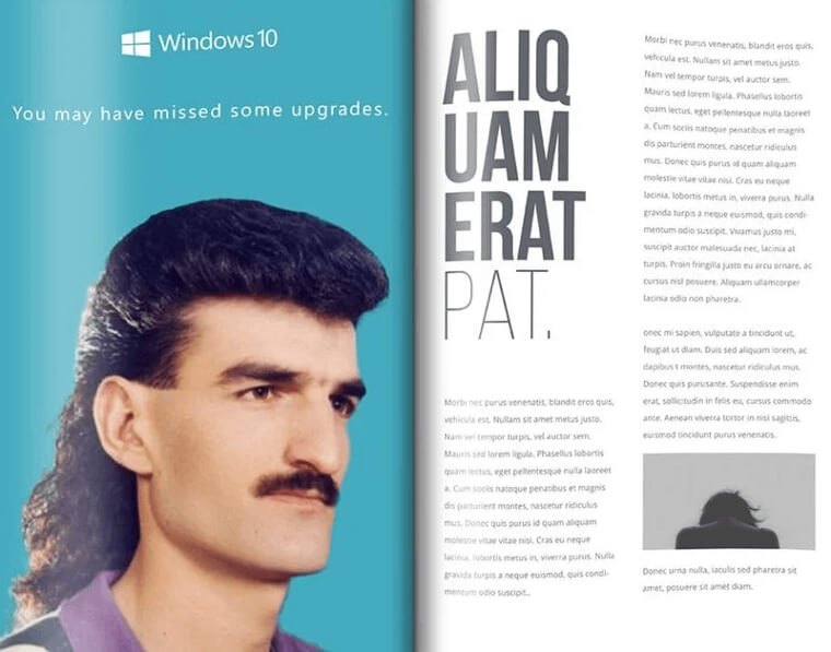
You can see how seriously they take this duty in their advert. The advert shows the image of a man with a hairstyle from the 80s. Nobody wants to rock this hairstyle in the age we’re in. This advert is Windows’ way of telling you to update.
Listen to what the cookies are saying
We like this advert and find it very creative. It contains both creativity and humor, and it was made by Amori. Amori is a cookie snack production enterprise, and they have come up with the perfect way to push their new sweet treats.
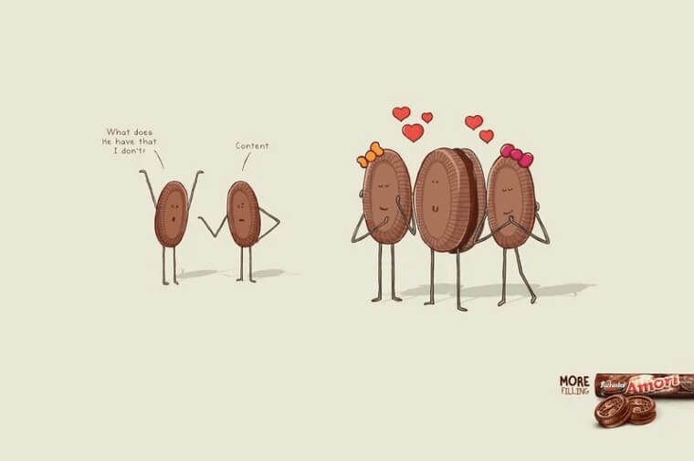
This advert is trying to promote Amori’s cookies with fillings, and we can see this from the ads; two non-filled male cookies are having a conversation about why the other filled cookie is getting all the ladies, and the answer is content. We think this is super creative.
The possibilities are endless
A good advertisement should be able to attract the attention of the crowd and also explore their imagination. This advert is one that was used by Hasbro, and it is one of the best adverts yet. It is simple and also creative at the same time.
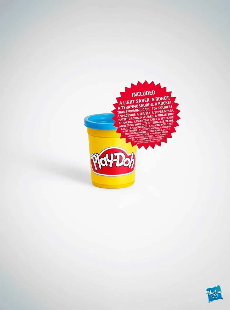
The product being advertised is play-Doh, which is a type of clay for kids to play with. It can be shaped and re-shaped into anything that you can imagine. The advert shows the unique property of this product and, at the same time, pikes the imagination of the viewer.
Clever Handle Placement
Stop ‘n grow is an establishment that sells nail products and accessories to curb bad nail-biting habits. While their advertisement strategy doesn’t make use of a billboard or the more obvious methods of advertisement, they have still managed to market information regarding their business with style.
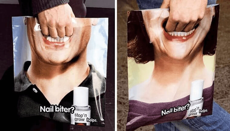
Stop ‘n grow came up with customized bags. These bags serve as their advertisement platform as it shows a mouth where the handle of the bag is located. The picture on the bag makes it look like somebody is chewing on the fingers holding the bag.
A classic New Yorker joke
Manhattan mini-storage is an enterprise that deals in property moving and also leasing of mini-storage spaces all over New York. Their advert is very creative and is written in such a way that every New Yorker can understand the joke.
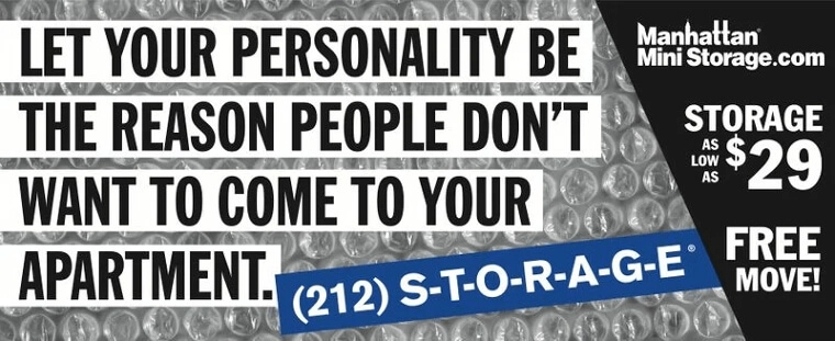
Most of the apartments in NYC are small and cramped, which is where the idea for the advert comes from. The advert reads, “let your personality be the reason why people don’t want to come to your apartment.” In other words, don’t let space be the reason why you don’t get visitors. Contact Manhattan Mini-storage.
Super Punny
This advert is one that got us laughing. It is owned by Ikea. For those that don’t know what Ikea is, it is a company that makes and trades ready-to-assemble furniture, kitchen, and home accessories. They are a worldwide establishment.
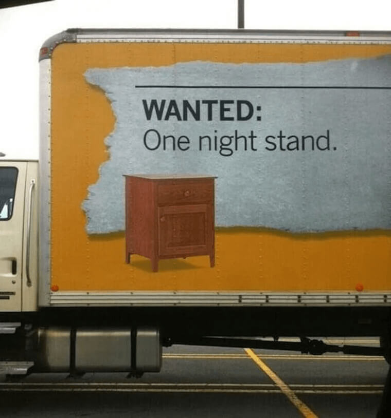
This advert of theirs is pretty funny, and it makes use of puns. Based on the nature of their operation, they were able to come up with the perfect advert using wordplay that we can all understand, a one-night stand.
Watch Out for Those Charges
This advert was used by Chase. Chase is one of the leading American banks today, and they are involved in all forms of financial transactions. This ad was created to advise and remind their customers of their accumulating bank fees.
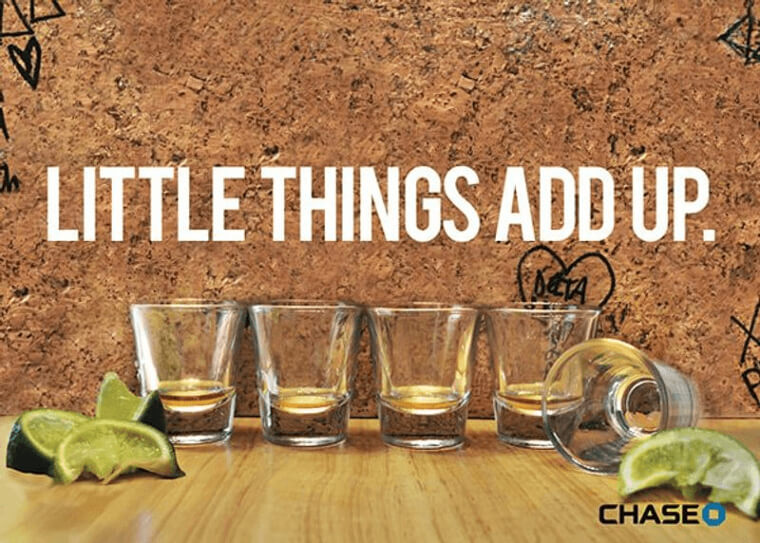
The advert in question shows a row of shots and then a caption the says, “little things add up.” The empty shots glass refers to how we always start with one shot and then keep getting more. The same applies to bank charges. They seem insignificant, but they always accumulate.
Poo Poo Poo Poodle
This advert is pretty creative and helpful. The advert was used by a speech therapy class. The classes are for those that face one form of challenge or the other when it comes to spoken speech and similar things.
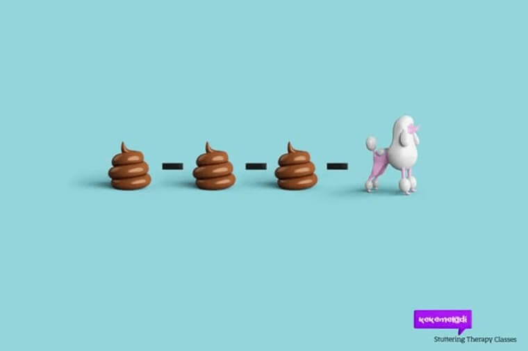
From the advert, we can see pictures. The first three represent the word “poo,” and the last one represents the word poodle. Apart from the fact that the advert shows what the class is about, it also shows an effective way of helping.
Low life
While most of the other adverts that we’ve talked about were focused on the business and the services that they render, this advert is quite different. The one was released by Toronto’s Live Green Organization, a big keep-earth-clean movement.
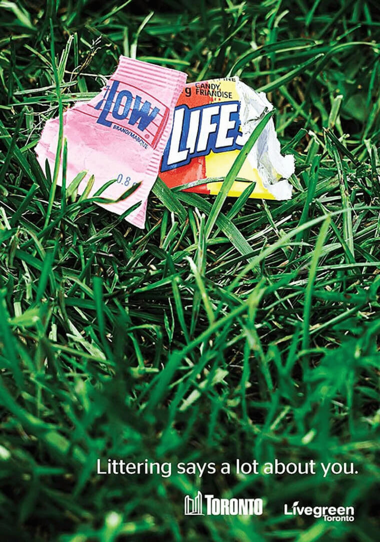
This advert is not designed to boost the sales of a product or the name of an organization. Instead, it is directed to make those who view it treat the environment better. The advert shows a picture of trash on the floor, and the trash reads “low life,” and the advert then goes on to say, “littering says a lot about you.” The message is pretty clear.
Now They Come To You
This advert is another super creative one that puts a smile on the face of the viewers. Artizone came up with the concept. They are a grocery company that deals with fresh food such as chicken, fish, and other livestock products.
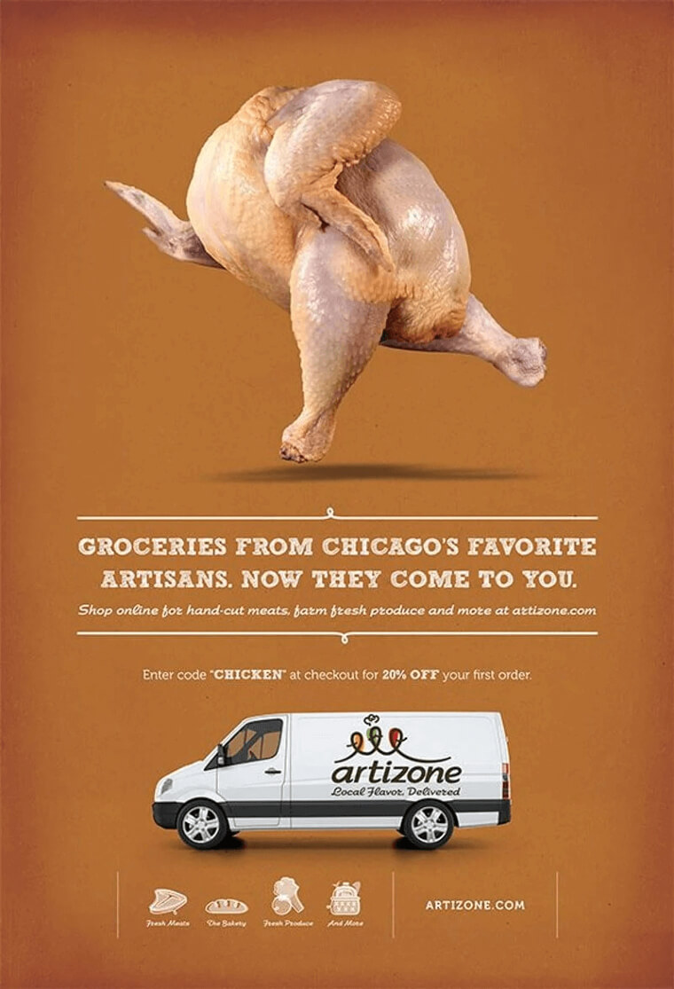
The advert is one of a kind, and it advertises their new delivery service. The image on the advert shows a chicken running towards something, most likely you who ordered it. This advert makes known the service they offer, and it does it with style.
You are what you wear
Some might say this advert looks like the trailer of a horror movie, but it is not what you think or what you see at first glance. It was created by Max shoes, a company that deals in the production of footwear and accessories.
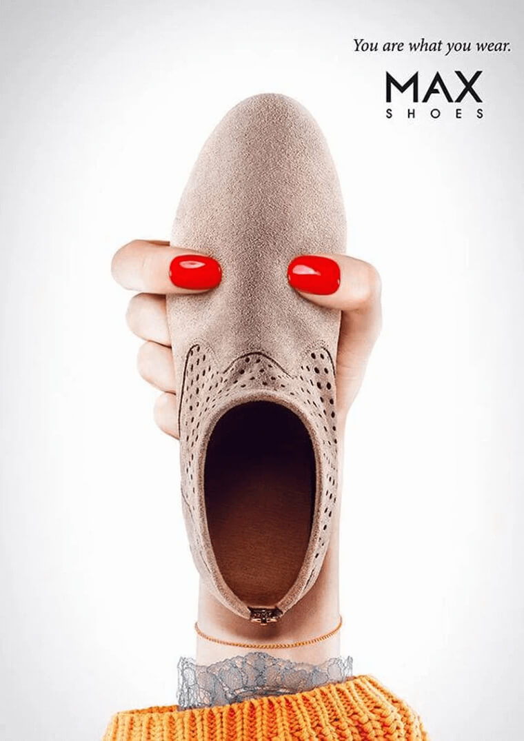
We mentioned earlier that the advert looks like something from a horror movie. This is because of the face formed using the shoe. The advert says, “you are what you wear,” and then tries to depict the image of the face using the red nails as the eyes and the gaping hole as the mouth. It looks more like something from Scream.
Bark in the park
What we have here is a dog advert. This advert is for a dog event that is meant to take place on the 21st of March. The advert is quite interesting to look at, and the peculiar image depicted on it is bound to get the attention of just about anybody.
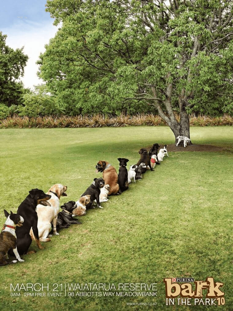
Just looking at the advert is enough to evoke a response from you because it shows the image of dogs lining up to “use the bathroom.” This advert is eye-catching, and at the same time, it takes a jab at the deplorable toilet situation at festivals.
Won’t you want your dog looking this happy
This is another dog advert that caught our attention, and we have to say this is one very effective advert. This marketing idea was used by the Dog Spa Course, an establishment that offers a full spa experience for dogs.
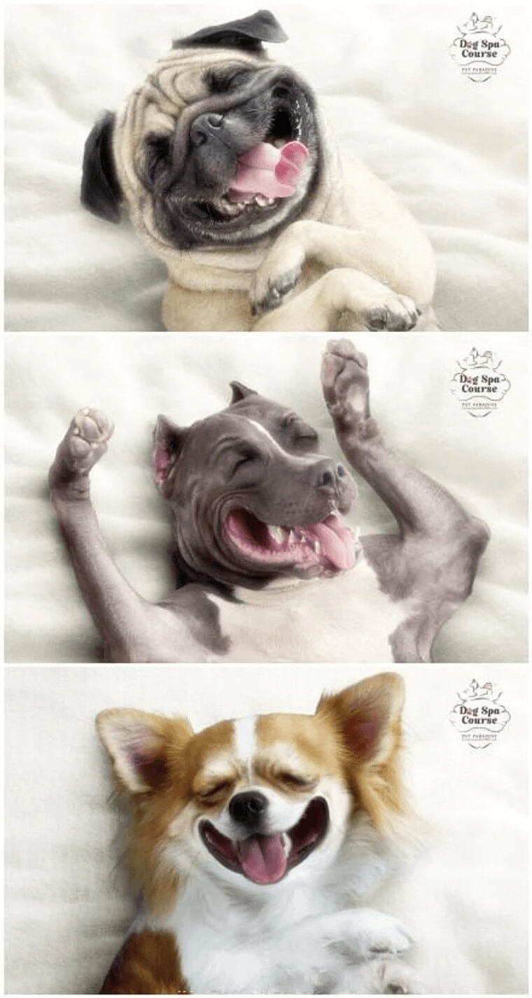
This ad is said to be very effective because it shows an image of satisfied customers. When the satisfied customers in question refer to dogs with expressions of bliss, you can imagine the effect that is going to have on dog-lovers.
The Ultimate Showdown
This is one hell of a creative advert. The advert was used by Topical Acne, a company that produces creams that are used for the treatment of acne and other facial impurities. It doesn’t include any writing, so it’s up to your imagination.
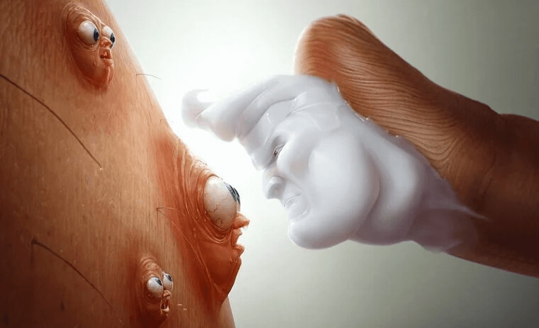
The advert shows the ugly and unattractive villain, the acne, who is about to face off with the good-looking hero, the great haircut, and the topical cream. You can also see from the ad that the acne has a look of terror on their faces when faced with their impending doom.
Two Kinds of People
This advert was used by Zamato, a food delivery company that has been around for a while now. The advert indirectly highlights the importance and reasons why it is better to have food delivered to customers instead of going to the restaurant.
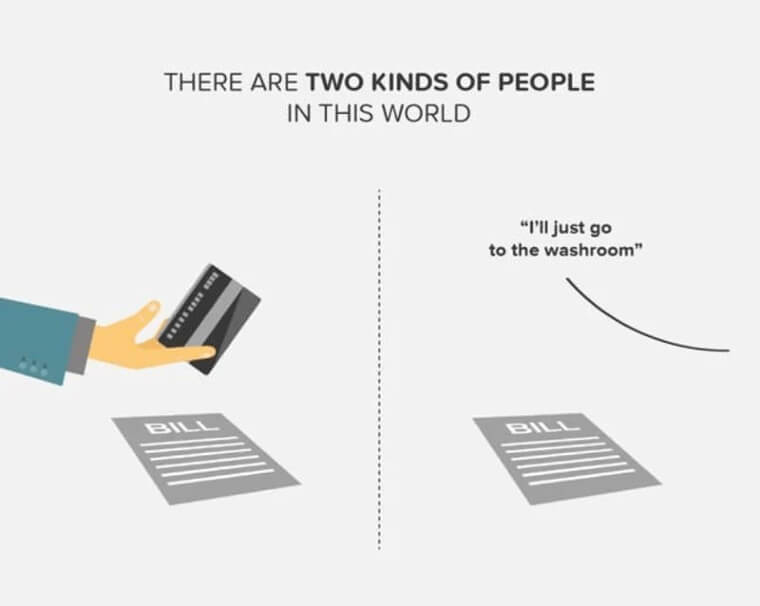
The ad shows two pictures. One side shows the image of somebody ready to pay the bill immediately it comes, while the other picture shows the picture of somebody who plans to skip the paying part. With delivery, nobody is skipping out on the bills.
Is he in a video game?
Talk about a cool and creative advert. This one has a simple and classic theme. The advert was used by Jim Rickey, a shoe company. This ad was created specifically for a line of their shoes called the “Honkey Kong.”
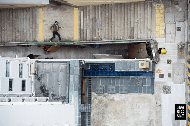
While the advert doesn’t make any special reference to their reference, the graphics and design that have gone into the creation of this advert are more than enough to make it one of the best ones we’ve seen so far. It looks like a 2d game, and the character in the game is wearing the Honkey Kong line of sneakers.
Breakfast on a bed
This advert shows some great graphics and intelligent play on words on images. The advert was used by B&B Hotels, a boarding service that offers breakfast in bed and also a bed to rest. It depicts these services with style and creativity.
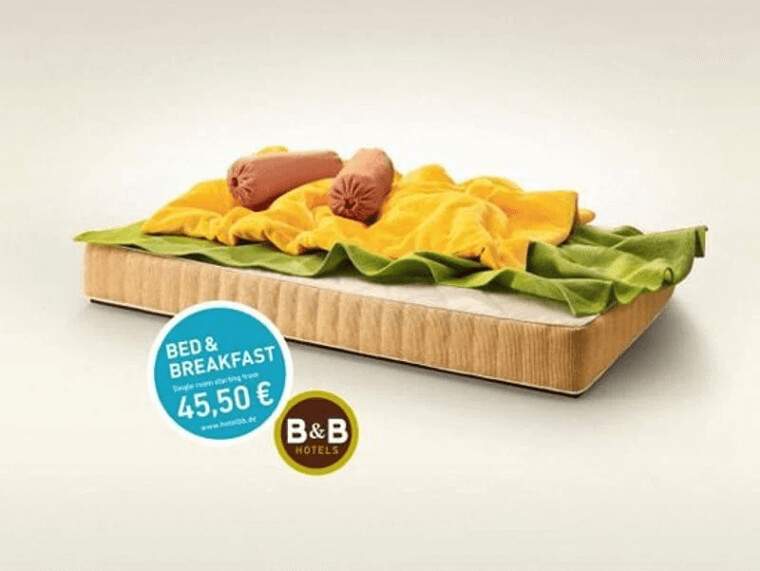
From the looks of it, you can already tell without the words the type of service that the hotel is advertising. The image on the advert shows a bed that is also a sandwich or one side of a sandwich. The pillows are sausages, the bed is bread, and the sheets are mustard and lettuce.
Straight out of the oven
One thing people like more than cookies are cookies that are fresh out of the oven. Thelma’s, a cookie-making organization, has realized this, and they have gone out of their way to bring you freshly baked cookies or something close to that.
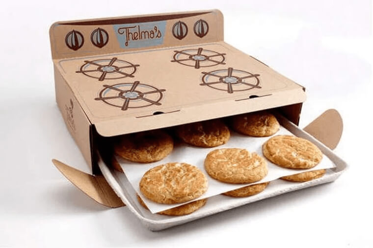
Thelma’s cookies have come up with a very creative way to package cookies; they make use of cardboard boxes that are shaped like ovens. Oven-shaped packaging might seem commonplace until you see how realistic Thelma’s cookies have managed to make their packing look.
Bending and stretching
This is another advert that has successfully integrated creativity and effectiveness. This advert was created for a yoga class by the name Yoga Center. This advert adds a touch of creativity and gives the viewer a very good idea of what the center is about.
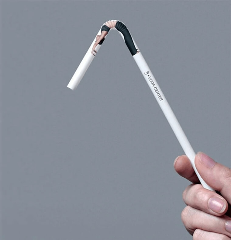
The advert shows the image of a woman bending. This can be said to be pretty normal for yoga adverts. However, the woman is bent on the bendy part of a straw. The realistic nature of this advert makes it eye-catching and informative.
Hairy Brushes
We’ve seen different types of creative adverts and ideas on this list, but this particular one has caught our attention. These brushes are called “Poilu” brushes, and the design of this advert is based on the meaning of the word “hairy.”
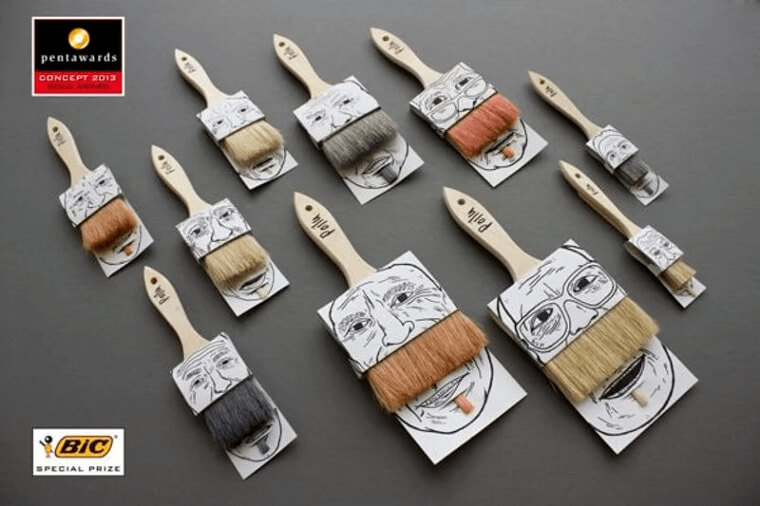
The advert shows brushes packed in cases that have faces on them. The brushes are also positioned in a way that makes them look like goatees and mustaches. This advert is very eye-catching, and the faces add a humorous effect.
Happy go lucky
This advert caught our attention because it brought back memories of a particular show, Madmen. While this advert might look like it is about a cigarette brand, it is not what it looks like. Happy go lucky is a brand of condoms.
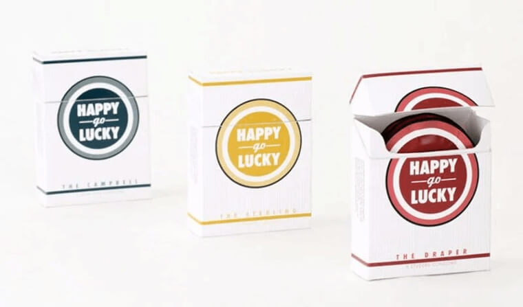
This brand of condoms was designed by students who felt it was a good idea to package condoms like a regular pack of cigarettes. It just so happened that the collection of the condoms was made in honor of the show, Madmen.
Family tree with Ikea
Ikea has come up with yet another mind-blowing advert. This advert is without a doubt one of the funniest and most creative adverts on this list. We already mentioned that Ikea is a business that deals with furniture and other home accessories.
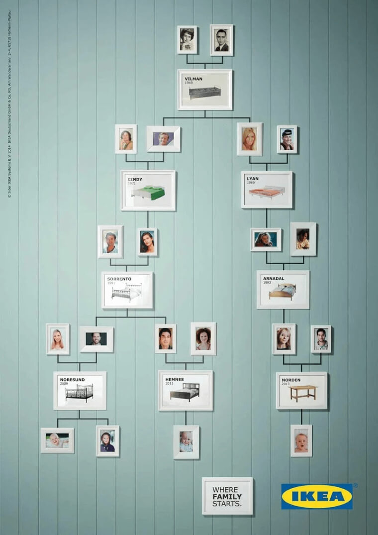
This advert shows the effectiveness of Ikea beds over different generations. The advert shows the image of a family tree starting from the late 40s and the different Ikea beds that each predecessor of each generation made the next generation.
Look from behind
Talk about being down to earth. This ad takes this phrase to a whole new level. Zest created this marketing idea, a food production company that makes pasta sauce and the likes. Zest has different types of sauces based on their ingredients.
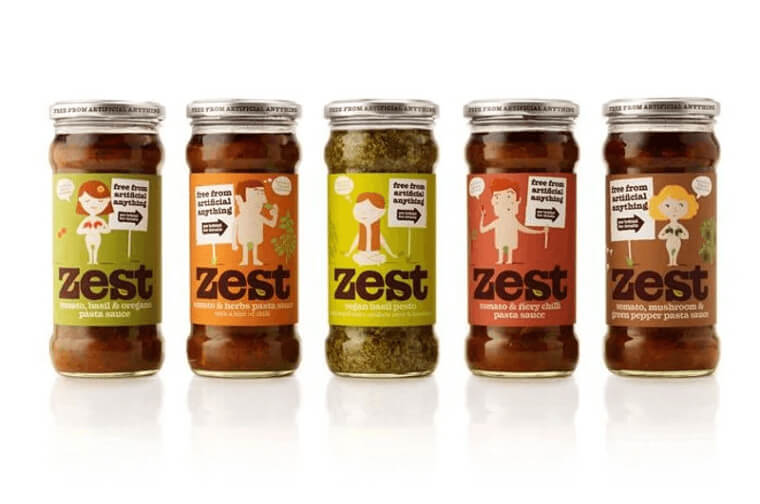
This advert is Zest’s way of distinguishing between their different ingredients and also showing you that their ingredients are all-natural. The advert shows the image of different ingredients, and naked people represent these ingredients to show the absence of artificial additions.
Knocked Out
How many people take out insurance in their teeth? We bet there are plenty of you out there. This advert is very creative, and it sure gets the message across effectively. The ad was created to tell people about dental implant insurance.
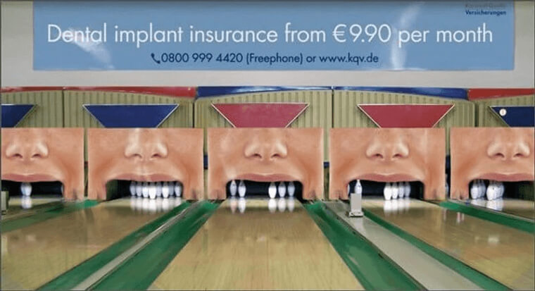
This advert is very creative because it represents the message of losing teeth in an imaginative way. The advert depicts the image of different faces where their teeth are replaced with images of bowling pins. It presents a representation of knocked-out teeth.
That Is One Strong Gecko Indeed
While most ads take the safe and straightforward approach to boost their sales, this is one that you don’t see every day. It was designed for Bench Fix, a hairstyling products brand. This should probably explain the somewhat eccentric nature of the advert.
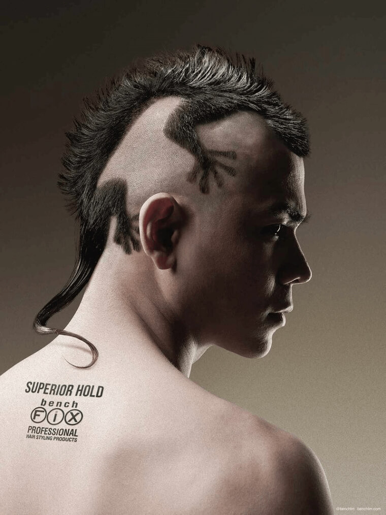
The advert shows the picture of a man with his hair styled as a gecko. Rationally speaking, a man with a gecko for a hairstyle is not something we usually see, and this is why we find it hilarious and effective.
Binder pools
This advert was orchestrated by Kielo Travel agency, an organization that arranges flights, vacations, and other travel-related business. This advert is quite creative, and it passes across its message in a very subtle and interesting way that not many people would think of.
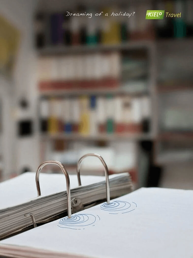
The advert shows a book left open and a caption that reads, “dreaming of a holiday.” If you take a closer look at the binder, you’ll see that there is a drawing of a pool, and the binders look like the ladder of the pool; this represents the distracting thoughts of a holiday vacay.
Clear Goals
This advert passes across the major message without any words. It was used by WeightWatchers, a fitness club, and you can already guess what happens in a fitness club. The ad is simple, communicative, and doesn’t beat around the bush.
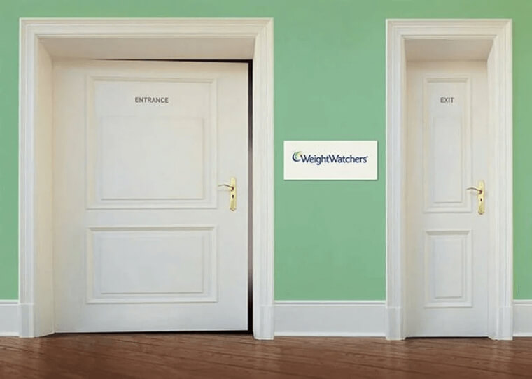
The advert shows two doors, one wide and the other is narrow. The wide door has the word “entrance” on it, and the other door has the word “exit” written on it. This clearly shows that there will be a size reduction before the exit can be used.
Embracing HipHop
While most of the other ads have been centered around promoting a business or a product, this one is centered on promoting a brand of music-hip-hop. This advert was created to raise awareness and acceptance of hip-hop and its culture.
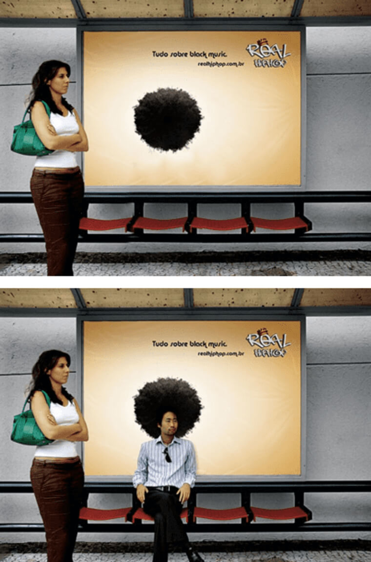
The context of the advert might be lost on you if you look at only the first picture. However, if you look at the second picture, it will start to make more sense. The round black ball is meant to be an afro that you can sit under and take pictures.
Sleeping on the Job
This advert was used by The Lazy Farmer, a business that sales of dried fruits. This advert is very attractive, and the designers took it quite literarily. The Lazy Farmer offers different fruits for sale, and we can see this from the advert.
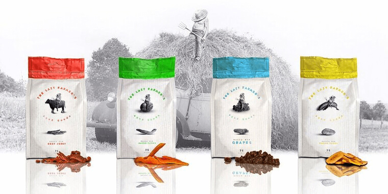
It displays different types of fruits that are available for sale and what they look like. The packaging of these fruits shows the image of a farmer sleeping on top of the different fruits they contain. I guess the fruits are all dried because the farmer slept off on the job.
Make Yoga not War
This advert is one that cracked us up. It was used by Escapo Clara Luz, a yoga center in Brazil. The advert is advertising their business and at the same time promoting peace. This is one of the best so far.
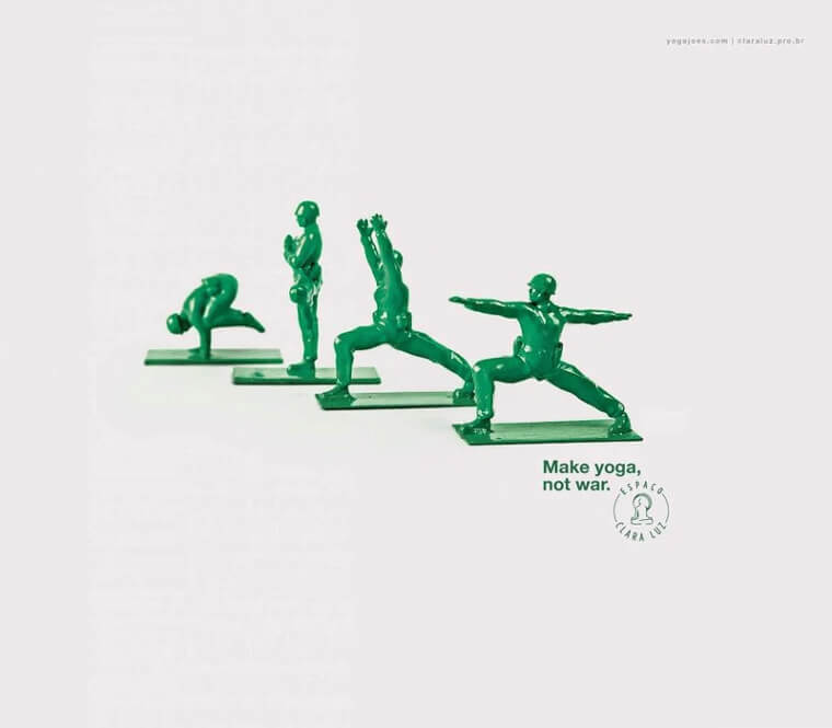
The advert shows the image of our popular toy soldiers, but instead of the soldiers carrying guns and normal army gear, these soldiers are performing yoga instead. The caption “make yoga and not war” fits this advert perfectly.
Save Money
Of all the adverts that we’ve discussed so far, this has to be the best. Durex has always come up with the most creative and funny of them all. They have the ability to come up with content that the audience never sees coming.
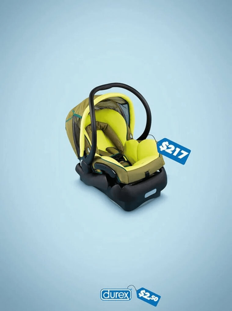
This advert looks simple and all, but you must undoubtedly have laughed after seeing it. It consists of a baby carrier with a price tag of $217 and Durex, which costs $2.50. Without the need to say anything, Durex has left the choice to you.
Before and After
Men’s Health magazine used this ad. This advert is related to fitness, and you can see it from the advert. The ad is designed in a way that calls the attention of the viewer back to the contents.
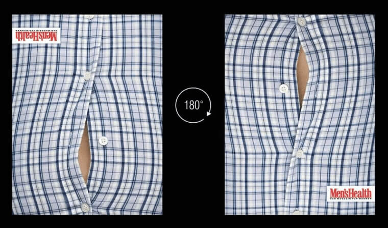
When you first look at this advert, you might want to look away, but something keeps calling your attention back to it. The secret to this effect is in the picture used. The images are the same, but upside down, the first looks like a man with a big stomach, and the other one looks like a man with a broad chest.