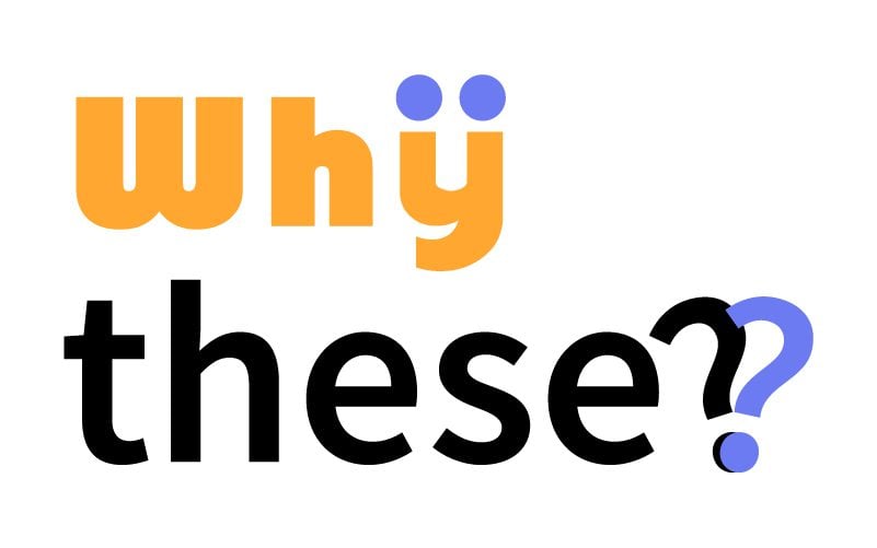
40+ Signs That Could Have Used A Graphic Designer’s Approval
Some signs overcomplicate the message they want to convey with their nonsensical phrases. They hit the spotlight with their head-spinning gibberish. If you call them insane phrases, you may not be wrong, but there are online communities devoted to creating preposterous signs. Although you might try to decipher them, turning your head or gathering friends is no help. It takes effort to read senseless phrases, like the ones we see printed on billboards, T-shirts, vehicle bodies, street signs, etc. Suppose they’re read counterintuitively, which makes it hilarious. However, reading these posters with intuitiveness will make you question the designer’s sanity. Well, it seems common sense isn’t expected; you may not need your detailed knowledge of sentence structure here. Kick that out of the window.
“Jesus Loves Bad Guys”
The license plate of this car is tickling. Driving right behind this car, caught up in traffic, raising your head to see this will make you burst into a fit of laughter. Who wouldn’t laugh at this? The license plate is perfectly – or imperfectly? – placed.
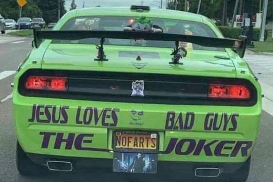
Someone trying to read this in traffic could get a headache from the nonsensical sign. In a comment session on social media, someone asked why anyone would do this to a car? Well, it doesn’t have to make sense, really.
Not Another Stupid! Funny Sign
Yet another gibberish poster somewhere in the world. Posters and signs are meant to give you instructions. In recent times we have seen hilarious posters that result from people trying to be clever. What’s in this sign? They missed their mark.
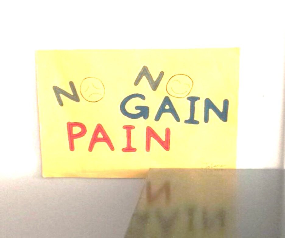
“No, no, gain pain. ” Trying to make sense of this nonsense isn’t that hard, but it still gives us headaches because the sign is wack. But you can understand the message in this post. Rearrange it to “no pain, no gain.”
Designing
Apart from this graffiti being plain and uninspired, it is frivolous and nonsensical. It holds a warning that we couldn’t hope to decipher even with the help of friends. All we see is a pile of rubbish and meaningless sign.
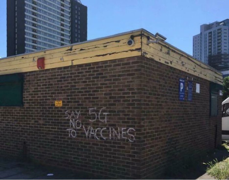
How do you decipher? This says, “say 5G no to vaccines?” Does this even make any sense? Heck no! Aside from it looking like the mastermind of this sign has lost it, nobody sees writing like this and even cares to grasp what it is about.
H AIDS! E AIDS! A AIDS! R AIDS! I AIDS! N AIDS! G AIDS!
Ever tried understanding the thought process of the designer of a terrible sign? We have, and this photo is a great example. It catches the attention of anyone who reads this gibberish, which is good, considering they want us to buy the product.
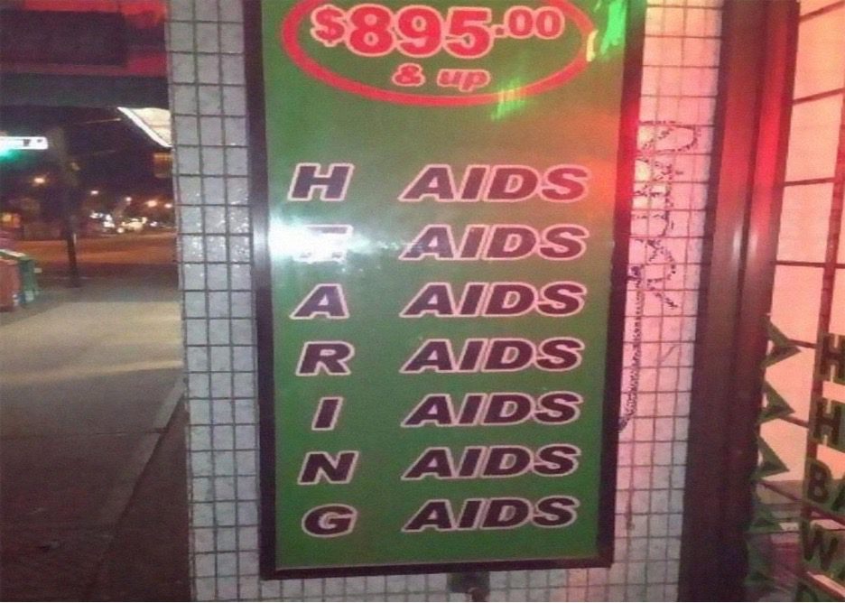
It’s a funny sign, and we can’t get enough of these hard-to-read signs. They have kept rolling out since the inception of “don’t dead, open inside.” With their tricky wording, these signs, posters, and billboard prints could help you get through your dull day.
Teen life 2018
Reading this messy text fast makes the head spin a bit. Your brain struggles to untangle this post while reading the text. The designer probably wanted people to question their sanity while reading this. Okay, maybe not, but didn’t they look at it after hanging it?
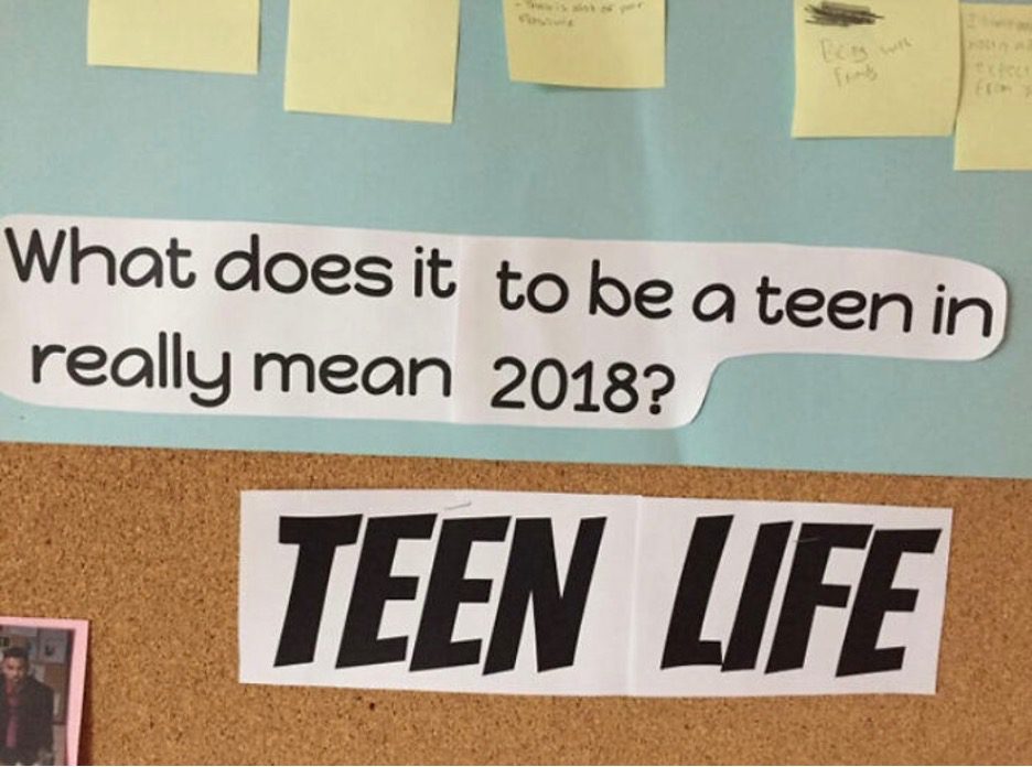
What does it to be a teen in really mean 2018? It means mean nothing. This is an absurd sign. You can’t make any sense of it. Teen life is hard enough. Just write the message normally. Or if you want to be unique, well, do better.
You’re Four Times It’s Hard To More Likely To Have Concentrate…..
You might have to look three times to comprehend this sign. It will take a while. It makes no sense until you let your brain untangle the messy text. And once you do, you have to give a hand to the designer of this one.
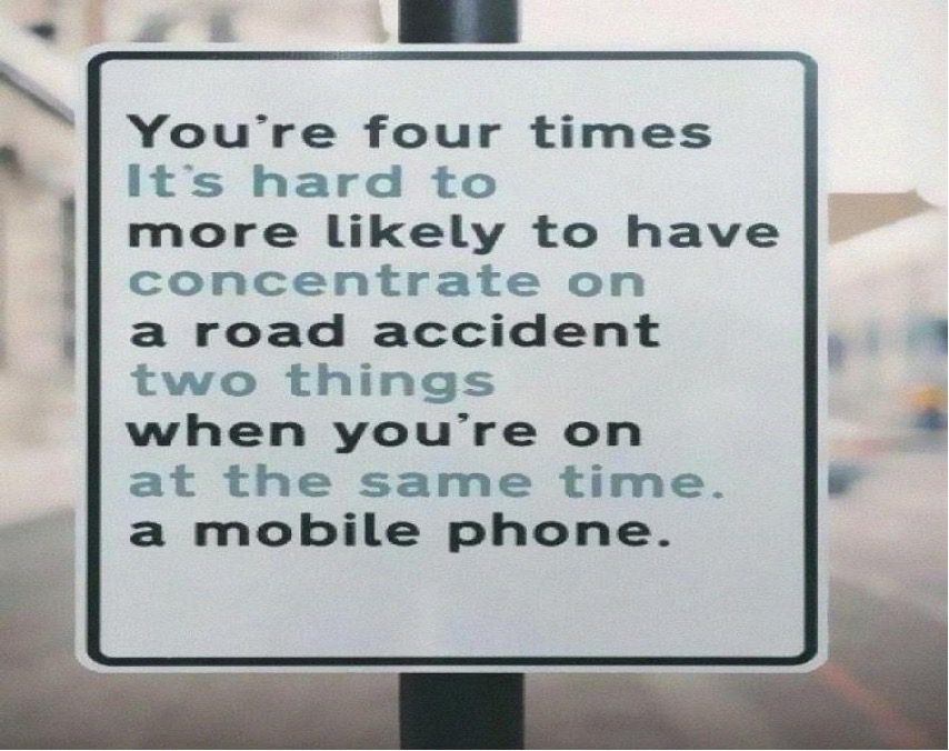
The confusion in this text is enough reason you shouldn’t read and drive for your safety and that of others on the road. They got their point across, but it will also slow down pedestrian traffic to a crawl, so maybe it is a silly design after all…
It Is A Paradoxical Fact
Remember that throwing your understanding of sentence structure aside will make you less critical of these hard-to-read signs. The “you don’t matter. Worry” sign does not communicate anything to whoever reads the post. Also, the placement of the words only comes with more worries.
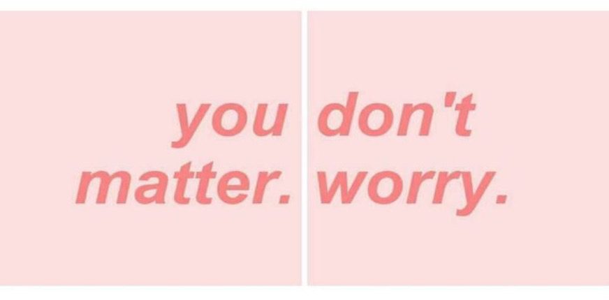
You would not be wrong if you called these expressions cursed. However, this phrase is recognized around the internet along with many other supposed-to-be inspirational signs that are turned dark by their bad design. Maybe the designers lost their touch?
Read it Aloud
It doesn’t matter how easily you can read the text. This is another sign that is hard to read, and which makes you wonder if the designer was in the right state of mind while creating this sign. We think maybe not.

Does this sound good? While reading aloud is difficult, it is also hard to comprehend, and you waste time reading something that adds no value to your day or life. Well, it doesn’t have to read well to make you laugh.
Love-Hate Relationship For Food
This sign “love hate food waste” was put in the dining hall of a school. It was, of course, made to deter the students from wasting their food, but the design would make you stop, then read again. Like us, you probably read this without saying it aloud.
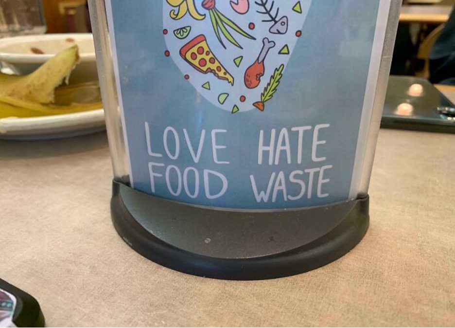
We guess that, over the years, students will be making fun of this sign and start saying they have a love-hate relationship with food waste. These are signs that only make sense if you read them without thinking too deeply about them.
I Am Shape In Love Of With The You
The chance of you understanding this with common sense is slim; you need to lack common sense to read this crazy shirt. If Ed Sheeran came across this print, he would burst into laughter because the sentence structure of his song is all wrong.
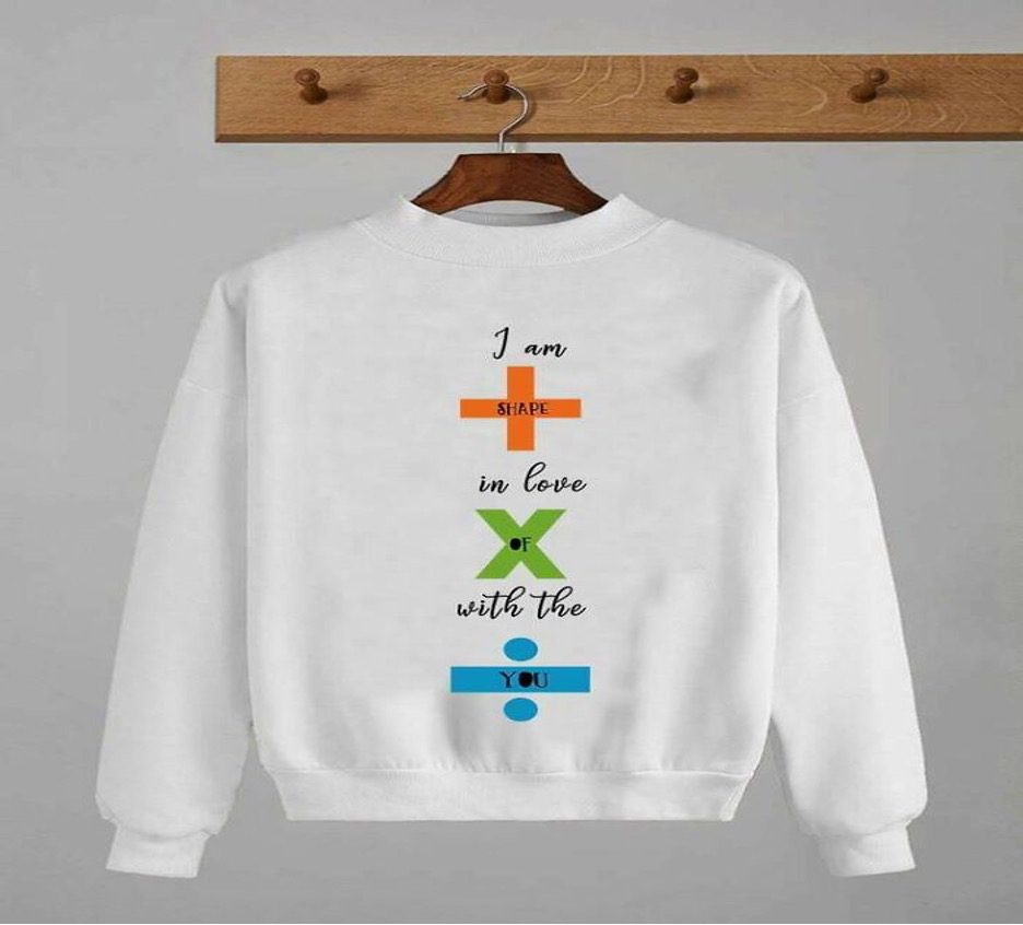
His song goes like this: “I’m in love with the shape of you,” right? We don’t know if this designer was trying to be a little more creative with their design or if it was a mishap. What is apparent is there is another poorly designed sweatshirt out there somewhere.
Drug Doesn’t Just Kill; It Affects The Brain
The person who wrote that knew it’s not meant for everyone to understand, except for someone under the influence of drugs. Whichever way you want to read this, leave English out of the picture. You just gotta vibe it, man.
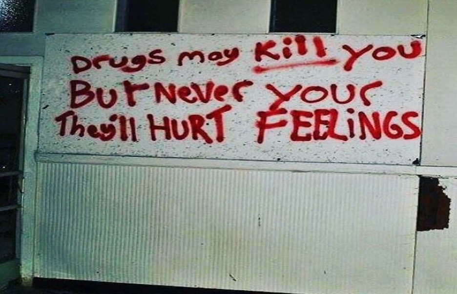
The drugs this writer took will not kill a person but may affect the person’s sense of sentence structure. Even though it is nonsense, the message eventually comes across. It might be a clever warning against drugs, but somehow we just don’t think so.
Fart Dust Sign
Signs like this, we actually like. Reading it vertically or horizontally will not change its readability. Read it as “so old I fart dust” or “so I fart old dust” – whichever way it does make sense, even if overall it’s just silly.
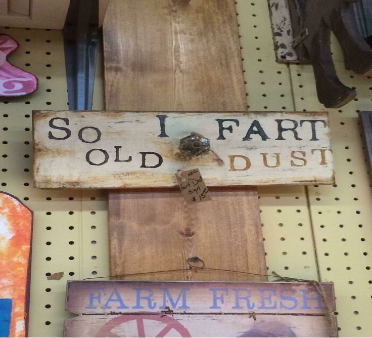
Like any writing, signs must be read correctly from top to bottom and from left to right. It is highly suggested to only publish photographs with little gap or spacing between the columns of words. If people can’t do this, fix your sign.
An Obscure Bathroom Sign
This bathroom warning will keep you itching your head— aside from that, its confusing instruction contains vital information that makes you laugh after reading. It’s a sign with many loopholes. You can’t get enough of this wrongly written sign.
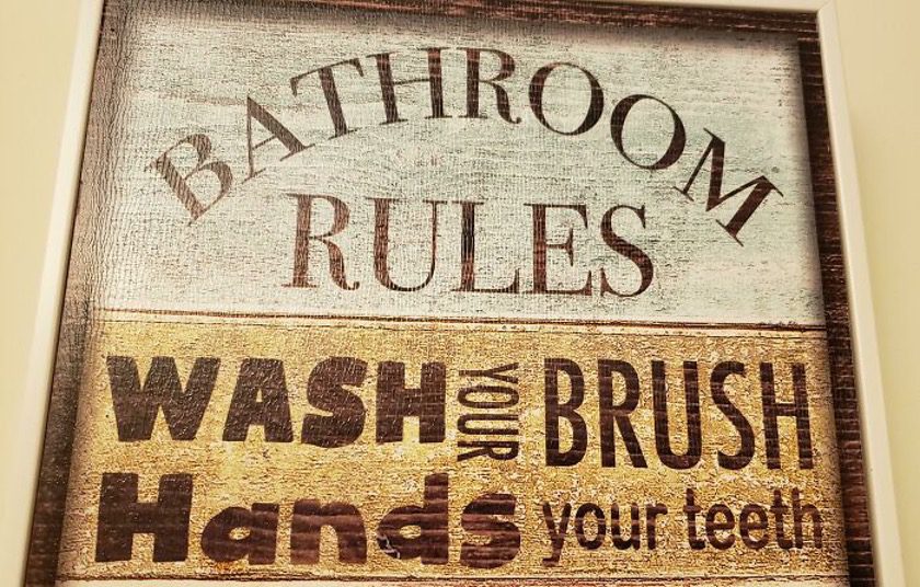
Heading into a bathroom and you see this, what would you think? Bathroom rules “wash your brush hands, your teeth” can only be a joke. However, the designer of this sign expects you to appreciate their ‘clever” design. So, don’t forget to “hands your teeth.”
Post The Malone Goat!
Although the word “GOAT” has developed a new meaning, you might still think of the farm animal because of the way this is laid out. The post reads, “post the Malone goat.” If you’re having a rough day, this might be a get-away ticket from worries.
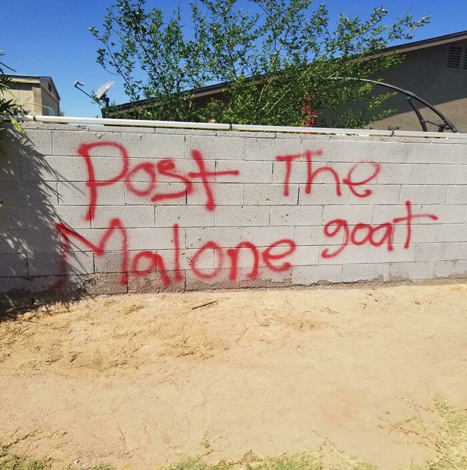
It sounds absurd if you read out, more confusing if you try to get the writer’s message. Anyways Post the Malone goat! This writer demands it! Seriously, stop writing in columns, people! Just put it all on one line. But this surely isn’t the end of our column woes.
They Made A Messy Craft From A Song
If you’re unfamiliar with the song, don’t read it. These signs are supposed to be simple, to the point, and sometimes just fun. However, this is a mishap that occurred as a result of someone’s rash ingenuity. Deciphering a sign like this can take up to ten minutes.
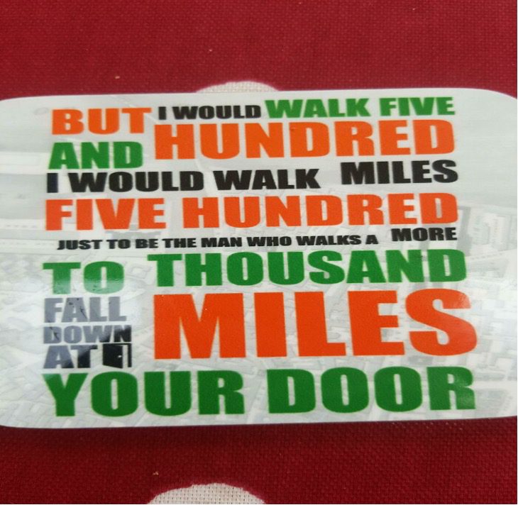
We can’t see someone getting paid to design something like this. The vibrant hues! Those aren’t random, are they? Maybe it’s the font size? Perhaps it was intended to be read just by those who are familiar with the song?
Don’t Dinner Open Inside
A girlfriend pastes this on the microwave to let her boyfriend know his dinner is in there. If you were the boyfriend, you would probably roll your eyes. You’d forget about your rumbling stomach, as this sign would take you down memory lane of memes you’ve come across.
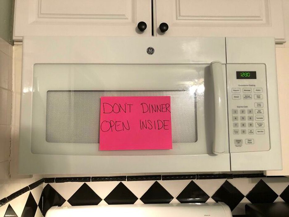
This post is, of course, funny. This is in no way telling anyone to eat, and the sign says, “don’t dinner open inside.” This post is another example of bad design. People will concentrate more on the post than the microwave.
Does This Belong Here?
Hard-to-read signs are rampant on the internet. Though some are short and simple, they are senseless. When a famous designer was asked about the component of designs, she said colors are essential. But other things should be factored in when crafting a design.

Laura, the designer, explains that an overly busy design can be misinterpreted, causing the entire design to lose its value. In a successful sign design, “type of font, letter size, spacing between the letters, and text positioning” are most of what makes a sign readable, and all this is exactly what this design lacks.
What Are Trucks Suppose To Carry
Who comes up with “real trucks not carry loads, not handbags”? Even when you read it right, it is still senseless. Yep, another eye-roller here. What else can you use a truck for carrying things and people from one point to another?
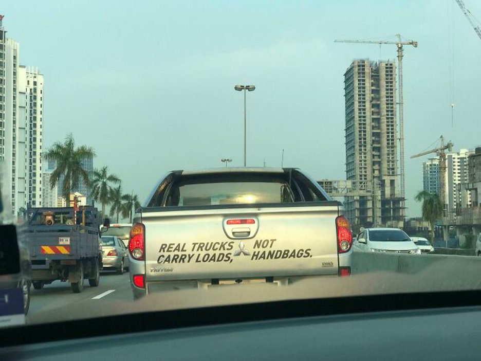
Although senseless, this sign attracted the attention of the person driving behind this truck. It most likely caused lots of stares on the road. Many on social media feel this person is toxic; others feel the truck owner is a misogynist. The point is to be careful of signs, and if you go for any, they should be readable.
Open Men Slowly Working
Another phenomenal sign made up of gibberish. This sign is a waste of your precious time. “Open men slowly working” means a bunch of nothing. The use of arrows is cute, but doesn’t stop us from reading it wring at first glance.
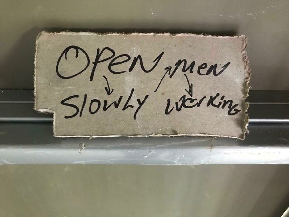
A sign that lacks readability will only mislead the readers. This will make you pause while you repeatedly read it to get the sense of it. Maybe the writer wanted to tell passersby to open the door slowly and then decided to give a reason as an afterthought.
Some Tattooist Needs To Get Back To School
This photo of a tattoo surfaced on the internet and inspired “trust one” cracks by everyone who came across it. We don’t know if the tattoo artist meant to write, “trust no one.” This is more logical, but we see a person who needs to get a nice cover-up.
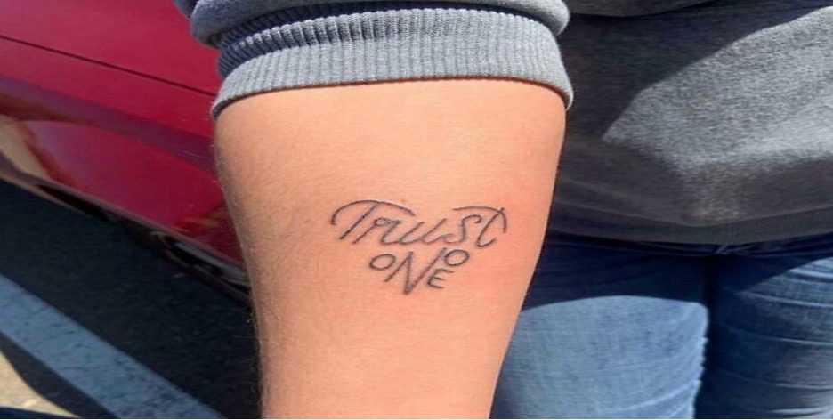
This tattoo artist needs to work on this design a little more. It has potential. It’s a beautiful tattoo that will make you laugh when you look closer. A tattoo that would spin your head or causing you to roll on the floor with laughter might be worthwhile.
Whoever Yes Thank John 3:16
This isn’t intuitive. If you read line for line, horizontally or vertically, this sign on the street will still be hard to read and comprehend. Who knows, you might understand after reading for the twentieth time in a row. If someone unlocks the meaning, can you clue us in?
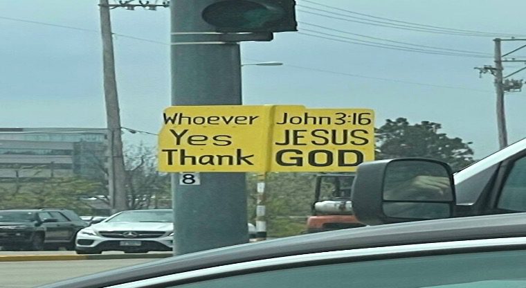
No matter the strategy you choose to adopt, there isn’t any way you could understand this street sign. Even though it is not readable, you can be sure the more you read, the more you laugh. This is like they are trying to convey a secret message.
A Nonsense Poster In An Academic Environment?
We’re used to encountering hard-to-read signs on the streets, on take-home food packs, business ads, etc. When you come across challenging signs in a school environment, you can’t help but wonder how much learning goes on in those classrooms.
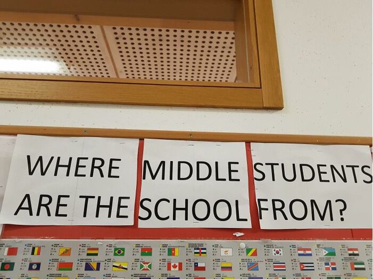
This gives you mixed feelings. You could laugh, but you cannot escape reading this twice, then looking around to be sure you’re in a school. The flags below the pictures tell us it is an international school. What a funny world.
Would You Please Choose A Accident?
This design may be pretty bad, but it is clear they tried. Every time people see signs like this, they try to read it normally: left to right. Hilarity ensues. Reading it the usual way will only cause you to question the designer’s reasoning.
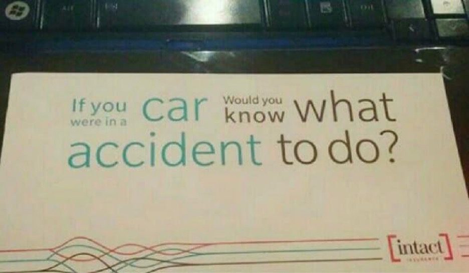
If you answer this question, be sure you understand the text so that you don’t say something contrary to the question. But take a look at this sign. We see they tried different colors to make their message clear, but they still missed the mark.
It Makes You Happy!
Day-to-day activities stress us out sometimes. Hence, stumbling on a hard-to-read piece like this can brighten your day. As difficult as it seems to be, it is a sign that we all should read. Everyone might not be able to visit the store that harbors this masterpiece.
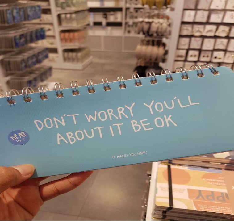
It’s worth the read. Are you going through hard times? Are you experiencing a rough day at work with your boss? This masterpiece is for you. Try not to be too hard on it. You don’t need to be competent to read this. What you need is your sense of humor.
A Masterpiece Of Gibberish
Looking for reasons why you shouldn’t give up? Here is motivation. You should strive to design better signs than this person! This isn’t just a design flaw either, like we’ve seen over and over again. This is a complete oversight.
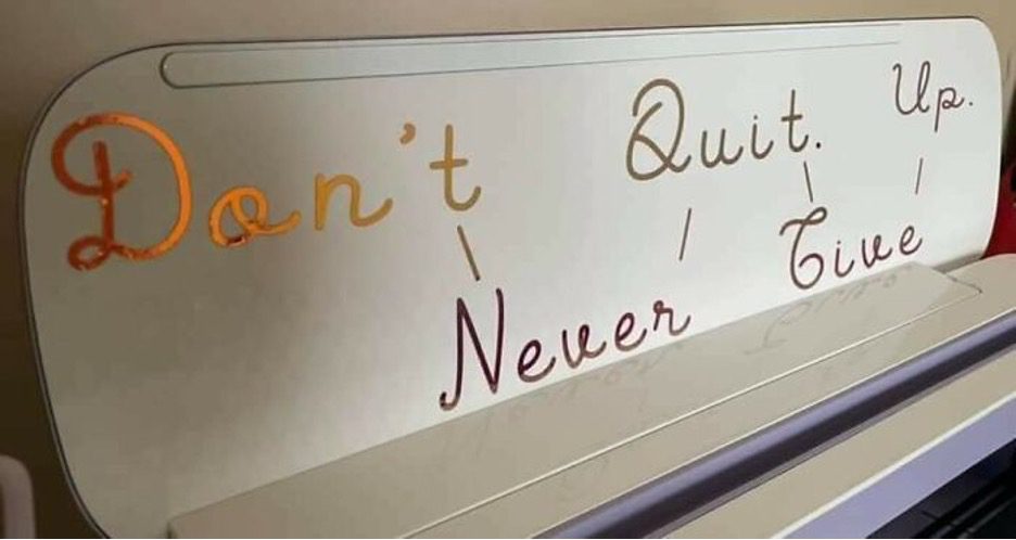
Although there are lines are connecting each word to try to help convey the meaning, this makes it worse. It’s one of those masterpieces you will think about throughout the day. But nonetheless, don’t quite up. Never give. Or don’t never quit. Give up.
Toilet! Toasters! Telephone!
Surfing the internet and you see a picture of this, you’d stop to read. The font size, style, and colors are attractive, which will persuade you to pause and check it out. However, there is no message embedded in this sign. You will have questions that will be unanswered.
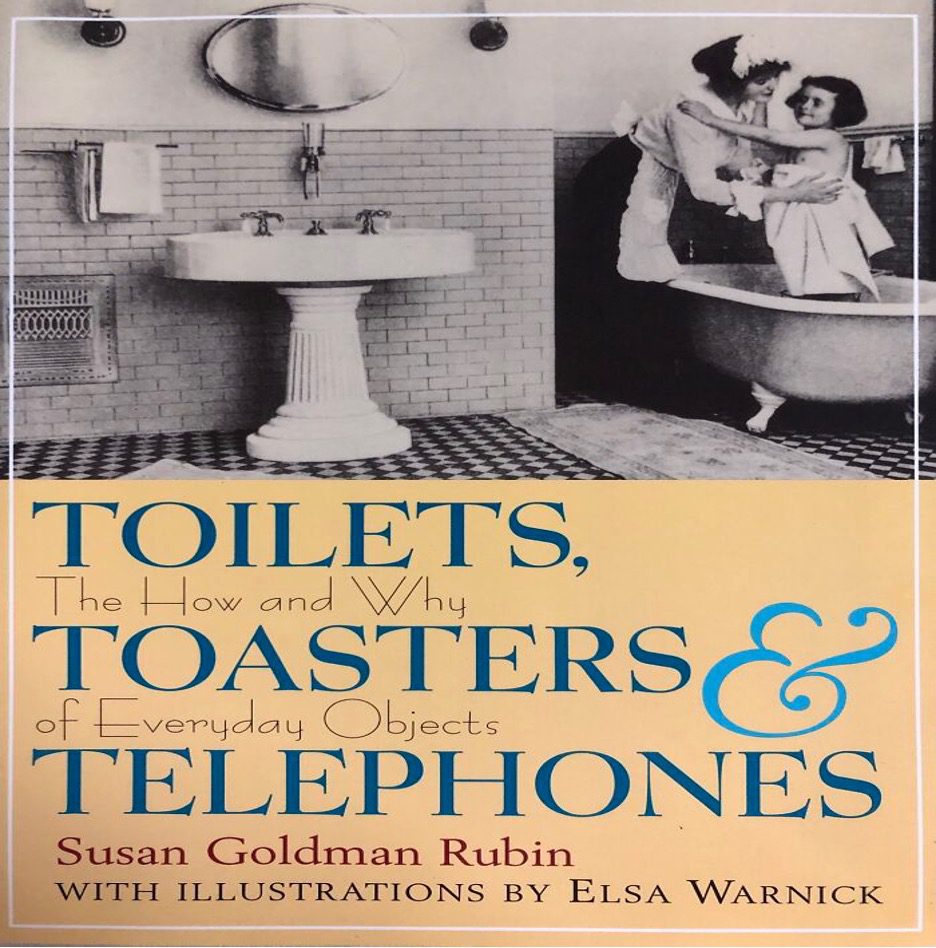
The sign reads, “toilets, the how and why toasters of everyday objects & telephones.” This is nonsensical, and your initial instinct to focus on the big words separately was correct. Susan Goldman Rubin needs to explain why she chose this design.
This Advertisement Is Confusing
This ad is intended to make its point to as many people as possible. This looks like a convention or an event of some kind. Maybe the whole thing is devoted to healthy eating, or maybe just this booth has the healthy goods.
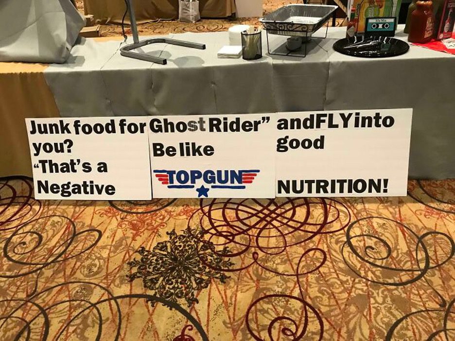
Whatever way you choose to read this, it still wouldn’t make sense. had they laid out the three posters further apart, the desired effect may have been achieved, but as it is, it just doesn’t look good for them. They missed the mark here for sure.
Teachers Love To Teach Children
You don’t come by life-changing words every day. Take this gem. This sign was in a non-English-speaking school. Whoever designed that sign didn’t do it for the kids to comprehend it. Maybe it’s a translation from another language that affects the sentence structure?
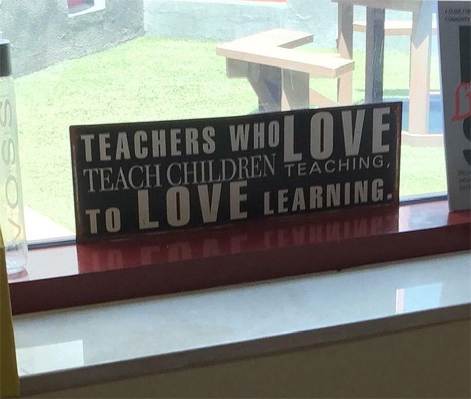
We’ve seen some bad ones, but this is one of the worst, because it had such potential. Despite the poor formatting, you generally figure out what these are trying to say rather quickly, but this one is a mess on every level.
Everything, Everything Is Wrong
This could be a famous slogan used in recruiting people into the force. But you might have to read this many times. Scrolling through comment sections to understand the text isn’t a bad idea. And hey, at least the artwork is nice.
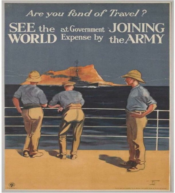
The text needs you to read it a few times. “See the government joining world expense by the army” isn’t clear. This hard-to-read sign has no appealing style; you would get even more confused after your first reading. So keep trying, folks!
A First, Second & Third Hot Mess Sign
This sign will mess with your head; they kept adding to the horizontal/vertical confusion. Little wonder we can’t even see that the cardboards were separate messages. They should have placed the third sign below the first two signs. Do you agree?
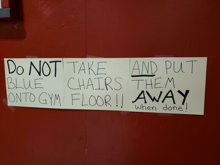
Agree or not, this sign lacks design skill; you need to read repeatedly and guess what, you still wouldn’t comprehend. If the character is meant to be read and followed, those who visit the gym might need an interpreter of some kind to help out.
Rosemon Plus Market.Com
When you try reading ads, logos, posters, slogans, you hope that it will make sense. You don’t want to get things twisted. But this sign doesn’t even follow the horizontal block text rules that have plagued us throughout this list.
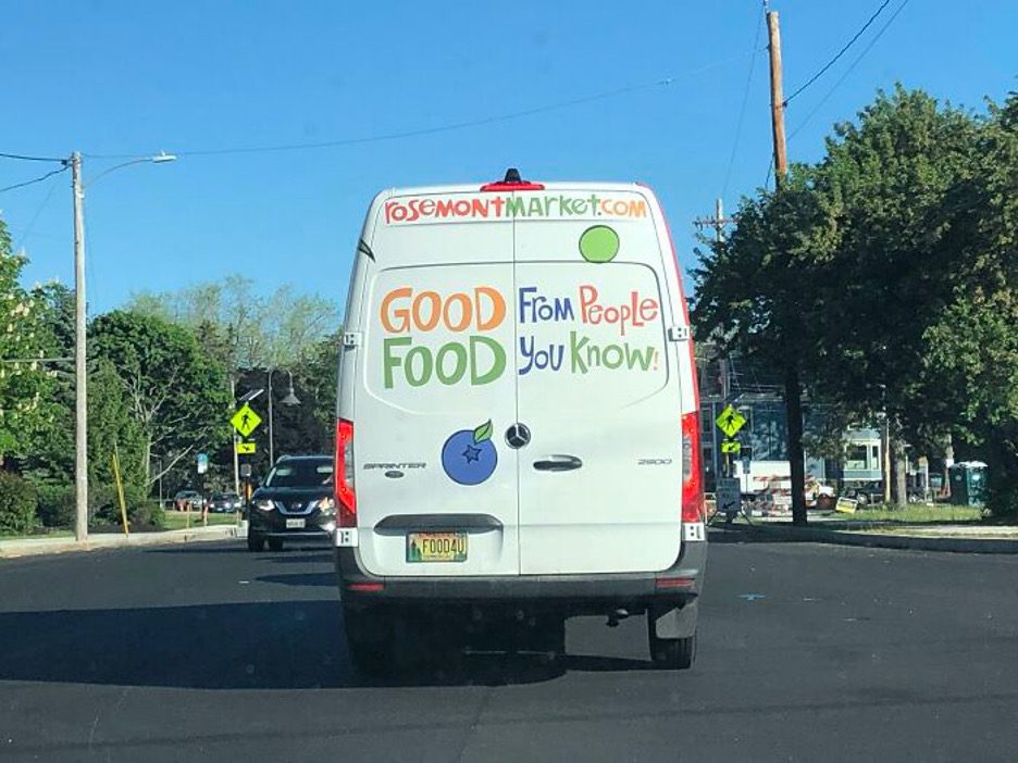
Reading this with all conscious reasoning will make you the slam designer. At least follow the rules we’ve gotten used to. The designer mixed up the colors, the orientation of the text, and just generally has us frustrated. It could have been so cute!
Coming Soon For Week Of Madness
Wondering why a designer would come up with bizarre signs like this could make your head spin. If you saw it all, then you see what we mean. These are getting more and more annoying. Designers seem to really love this weird style.
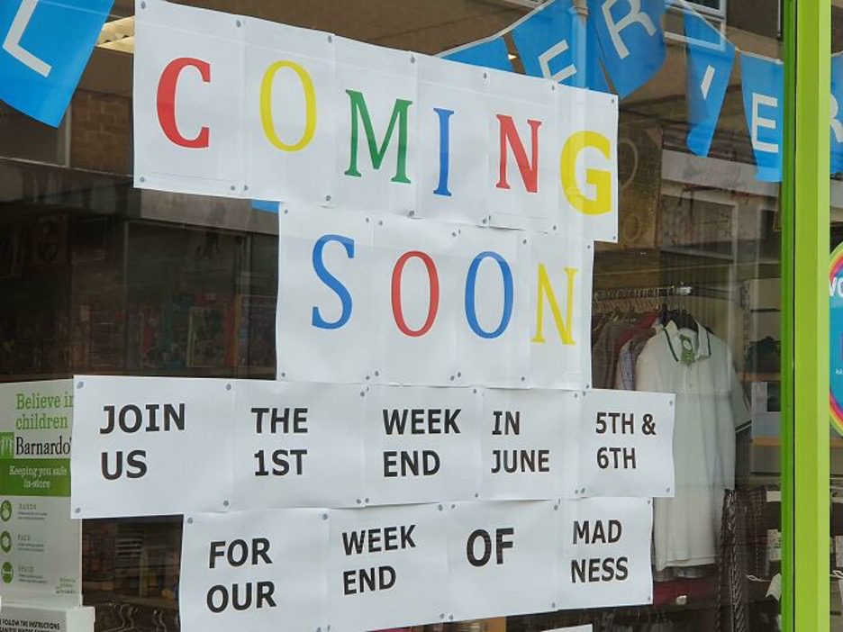
The brain behind this certainly needs a check. There is no sense in this, from top to bottom— left to right, this lacks any form of logic. That being said, this will need some improvement because it is the week of mad, our end “Ness.”
This Too Shall Pass
It takes time to realize the reason behind the font used for this logo. Again, you don’t need common sense to read this; hard-to-read signs need zero common sense. Fyi, the “Rejoice. Rebuild. The storm has passed” is an extract from a song.
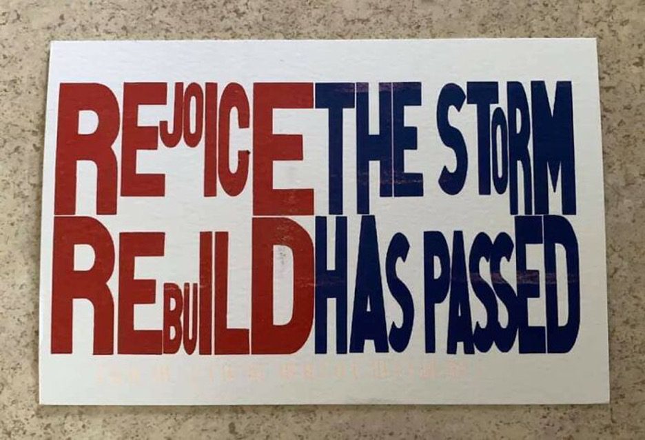
All you need to get a sense of this sign is to listen to Next Storm by Frank Turner, which helps you decipher what this is supposed to say. But It would’ve been clearer if they had picked a font that filled the empty area more effectively. There is far too much white area for the message to stand out.
S T I S O N L A E N D
We may never get why some brands splitting words into multiples is a great idea. That’s not what we want to deal with, especially in the fashion world. A mere look at this word is more like solving a puzzle. The simplicity didn’t make it any easier to read.
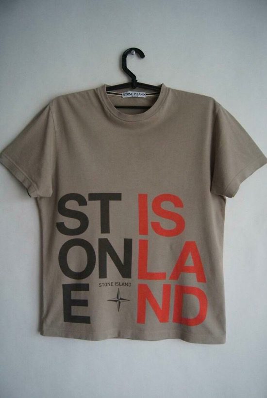
If you call your friends to read this, they’ll most likely pronounce the same thing. Saying this from one line to another will be like “St is onla e nd” this isn’t a word in the dictionary that we are sure of. The color difference, once again, did nothing.
Second Animal Hand Make
Twice reading wouldn’t tell you why “Second animals handmake first-class pets.” This shelter for animals may have meant well. However, you need to decipher this using the internet. When next you see this, we hope you realize it is an adoption center for pets.
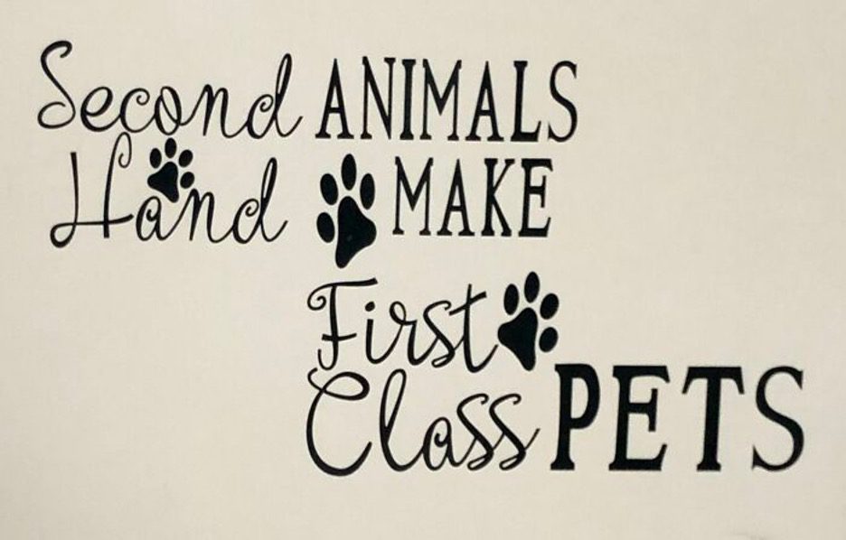
Figuring out the perfect way to read the sign can be difficult. It can be tricky, so take the time to read again. Some might not like the phrasing as well. But the point is, this design needs some work.
Red River Pizza Did It Wrong
Red River Pizza gives us a confusing message, saying, “Our is lobby open.” Many things are wrong about that. The words are easy to read, which is a point in their favor. But the way they wrote “LobbY” is pretty weird.
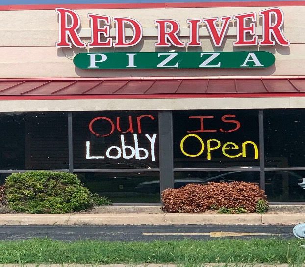
Another factor that makes this ill-conceived sign ultimately effective is that what you first see when looking at it is, “lobby open,” which perfectly gets the point across. Considering this, why didn’t they leave out the words in red altogether?
Don’t Monster Open Inside
Why would you want to open a place housing a monster? It doesn’t matter; by the time you decipher this sign, the monster will have already gotten you and dragged you inside this warehouse. Perhaps not. Maybe you’d see “monster” and get the message straight away.
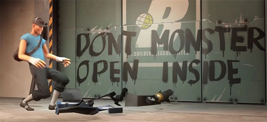
This was not thought out thoroughly, but it makes a nice meme. This is a Winglet game city, but even so, someone had to think of these designs, right? It might be intentional since Winglet has funny signs throughout the game. Assuming if it’s intentional, but it still belongs here.
Objectively there Is No Truth
Although not reading intuitively will make this sound gibberish, remembering to read each block separately gives this phrase a different tone and meaning. Whoever designed this wanted it to get attention. Would you read this properly upon first seeing it?
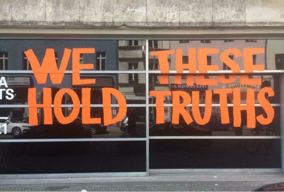
“We these Hold Truths” will make you smile after reading this a second or third time. Even though it is hard to read, the attractive color, bold font, and recognizable phrase will eventually win you over to this one. At least they spaced it fairly well.
It Mean To It Mean Does It Care?
Designers creating colorful rubbish is fantastic. Why do designers insist on these funky, not-so-clever designs? This masterpiece of nonsense is a sign that will confuse you when reading; you would laugh till your eyes teary. It’s really quite the mess.
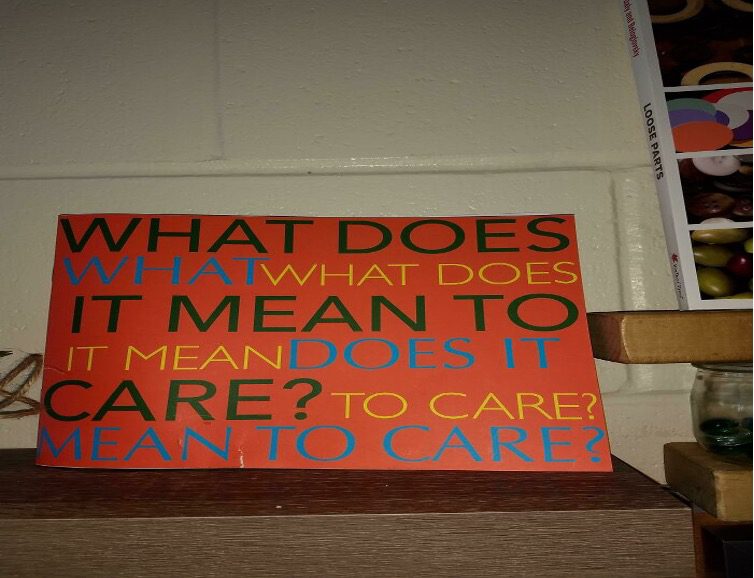
This sign resting on the wall has a message but that gets lost in the design fail. Who is the creator of this? is this in an office, a school? What was the designer’s thoughts? What other ideas did they reject?
Them It Magic
This head-spinning sign makes your thoughts a little scrambled at first, but you eventually understand it. Take out the word “them” and reread the line as “they kissed, and magic, it was,” and you’ll have a poem written by Yoda. There’re lots of ugly graffiti out there. At least this is trying to be cute.
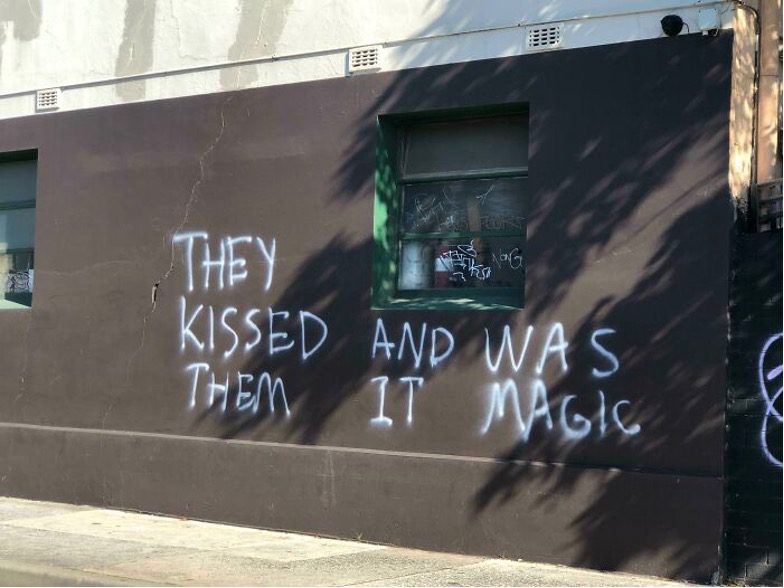
Except when your brain is on autocorrect, this graffiti is heartwarming. Who knew there is so much sense in nonsense? We think these signs are getting to us. Nothing and everything makes sense all at once. But really, take out “them”, and it fixes the issue.
What Do To Improve have To Do?
We all remember these fonts from school. And maybe some of us tried to make designs like this. We hope you were more successful than this person. It takes around five rereads to figure this out. You’d find it hard to fathom what is being said. So take it slow.
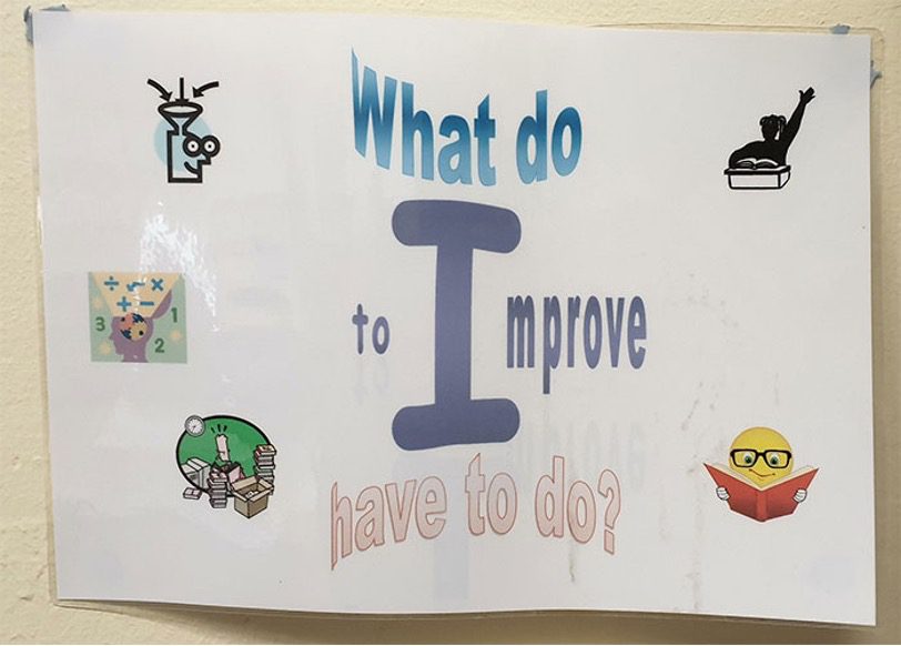
What do to improve have to do? Figuring that out rests on you. This might be a linguistic mishap or a designer who is tired of the norm. Being creative can be what this is called, but it makes no sense.
Intelligence Is Just A Starting Point
It takes multiple tries to figure this out. Like every other hard-to-read sign, this isn’t as straightforward as it may seem once you get it right. When you start reading, you may overlook “Intelligence” as part of the sign. Do not feel bad.
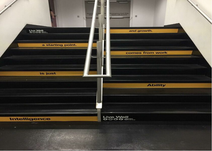
You might not notice some words because nobody looks at their feet to read a text— except someone who walked up the left stairwell, down the stairs, and then up the right stairwell while looking down at their feet. And the placement of these graphics is frustrating to the eyes as well.
Either Way, This Doesn’t Fit Here
Who else just saw “MEME” first and almost moved on? Then, like us, did your brain say, “this is MEME”? We don’t blame you. Our brains did the same thing, and we saved this for last because it is our favorite on this list.
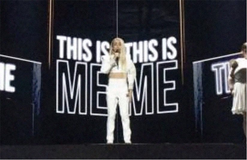
We wonder if the designer is a collector and lover of dank memes, or if this was a total accident. If the latter, we need to educate this person on the glorious world of memes. But maybe we don’t need to since, since they’ve entered it themselves.