
Less Is More: 35+ Pictures Reflecting The Beauty Of Minimalism
At its core, minimalism is more than just a design philosophy—it’s a captivating celebration of simplicity and purposeful reduction. It encapsulates the powerful notion that less can indeed be more, a concept that subtly influences our daily lives without always drawing our conscious attention.
Today, embark with us on an exploration of the “less is more” concept. Through a stunning array of images, we’ll unveil the artistry behind minimalism—a philosophy that extends far beyond aesthetics. It’s a visual dialect where each element serves a deliberate function, painting a narrative of elegance and refinement through uncluttered spaces and sleek designs.
Prepare to witness the enchanting impact of intentional simplicity as we decode the visual language of minimalism. In a world brimming with complexities, we’ll showcase how finding beauty in simplicity isn’t just a passing trend but a timeless and irresistible tale worth exploring. Join us as we unravel the poetic allure of minimalism, revealing how in its understated grace lies an enduring and compelling narrative.
The Simpsons Reimagined as Legos!
Lego blocks, arranged with playful precision, embody the color palette of The Simpsons’ iconic characters. The vibrant hues form miniature figurines of the beloved five. Homer’s distinctive white-blue, Marge’s serene green, Bart’s rebellious orange-blue, Lisa’s electrifying red, and Maggie’s innocent light blue—each color is meticulously aligned in a vertical spectrum.
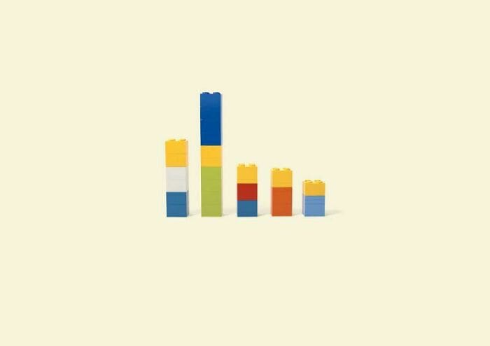
These Lego creations’ simplicity captures the characters’ essence, distilling their animated charm into compact, iconic representations. A playful homage to The Simpsons, this colorful arrangement transforms Lego blocks into a delightful showcase of Springfield’s most cherished family in a charming and minimalist form.
Tesla’s Modern Minimalism
Enter the Tesla Model 3, where simplicity meets sophistication in a sleek interior design. The focal point is the expansive infotainment system, an innovative command center devoid of traditional buttons. Also, premium materials in neutral tones create a refined atmosphere, accentuating the clean lines and uncluttered spaces.

Besides, the panoramic glass roof bathes the cabin in natural light, enhancing the sense of spaciousness. Notably, the seats embrace an all-white elegance, strikingly contrasting the all-black steering wheel and control panel. This minimalist approach extends beyond aesthetics, defining a driving experience that seamlessly marries cutting-edge technology with a visually arresting and comfortable interior.
Foggy Midnight Aestheticism
In the eerie embrace of 3 am fog, this photograph captures an otherworldly scene, bathed in a red glow reminiscent of the supernatural realm of Stranger Things. A house’s terrace silhouette emerges with chimneys piercing the misty veil. Against this spectral backdrop, a lone building stands as an imposing structure.
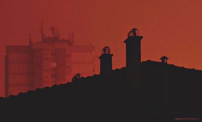
The red lighting casts an ethereal spell, transforming the mundane into the mysterious. And like a silent collaborator, the fog amplifies the mystique, blurring the lines between reality and the surreal. This haunting image, frozen in the stillness of the early morning, evokes a cinematic atmosphere.
The Power of Line Art
Bartosz Kosowski’s “Jaws” poster is a demonstration of artistic ingenuity. Crafted with precision, the iconic movie image is distilled into 202 solid lines, showcasing the artist’s mastery of minimalist design. Kosowski’s creative finesse breathes new life into the familiar, transforming the essence of “Jaws” into a mesmerizing visual symphony.
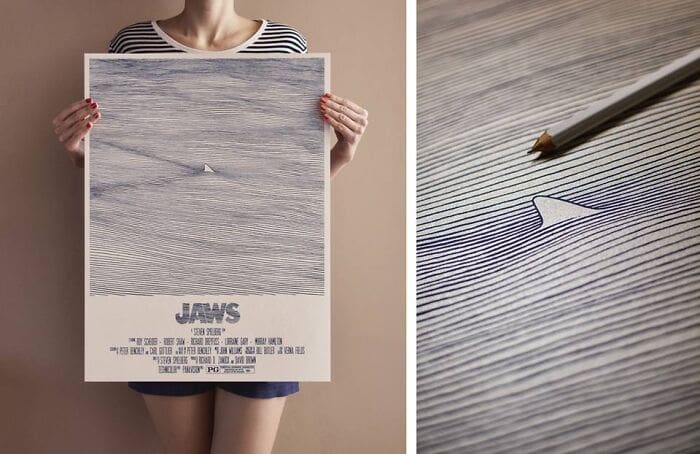
The film’s clever use of lines isn’t just for show—it’s like the Picasso of tension. It’s a nod to the eternal magic of movies, proving that simplicity isn’t just a pretty face; it’s the superhero cape of classics. Embracing the simple joys, this interpretation gives tradition a high-five and keeps the art vibes alive.
A Watch that Defies Conventions
A modest marvel, the black watch defies convention with stark simplicity. Its sleek face eschews traditional time markings and hands, embracing a bold design ethos. In the absence of excess, the watch only displays the current time in focus, blurring out the before and after timings.

This inherent design highlights how a necessity like time can be given a basic yet classy look. The timepiece’s understated elegance lies in its deliberate restraint, where the minimalist aesthetic goes beyond the ordinary and transforms timekeeping into an artful expression.
Maybe the Most Unadorned Magazine Cover Ever!
The front page of the Brazilian Metro newspaper for Copa Metro 2014 embraces minimalism with a captivating image. Against the black night sky, the bottom of the sheet reveals the edge of a brilliantly lit football stadium. The illumination emanating from the stadium forms a distinct contrast against the darkness, creating a visually striking scene.
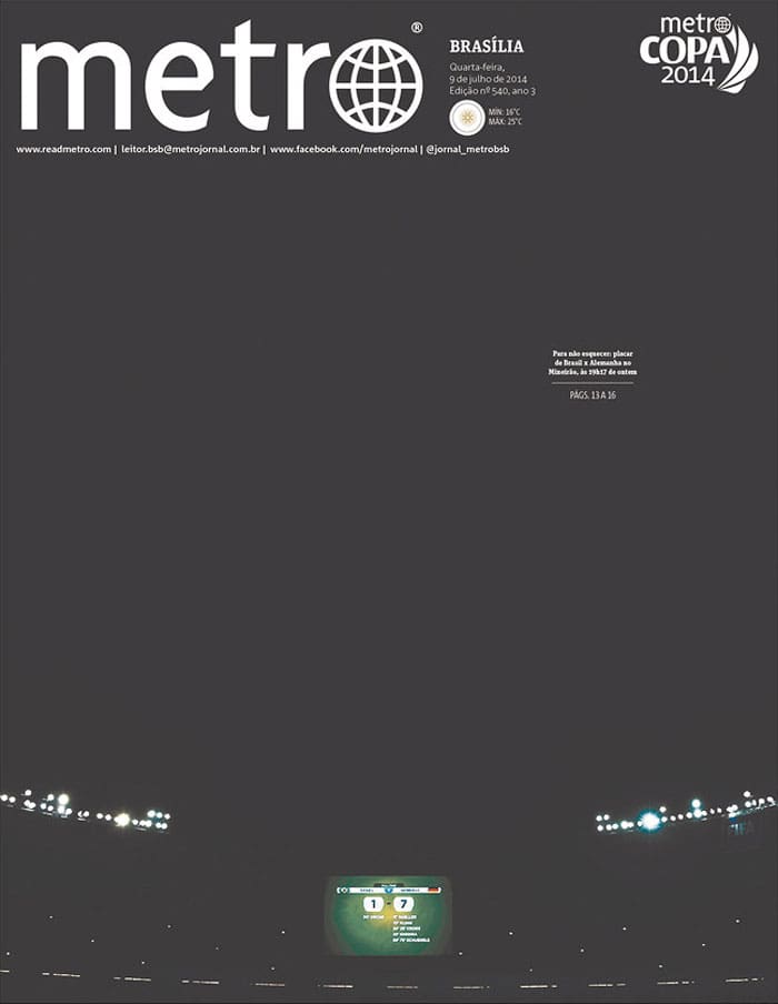
On the contrary, at the top corner, the words “Copa Metro 2014” are elegantly displayed, capturing the essence of the event. Thus, instead of an abundance of text, with the help of a powerful visual narrative, this minimalist design encapsulates the energy and enthusiasm surrounding the football tournament in Brazil.
Dunes of Silence
In the silent theater of the desert, less becomes undeniably more. Vast stretches of unbroken dunes unfold with nominal elegance, their gentle waves visible only to those who pause and scrutinize. This arid expanse, where simplicity reigns supreme, whispers a profound truth.

In the serenity of the dunes, the absence of excess allows the undulating grains to tell a story of timeless beauty. Against the canvas of an unblemished horizon and a cloudless sky, the minimalism of the scene becomes a reminder that, in the grandeur of nature, the subtlest details can evoke the most heartfelt awe.
Chess Set Design Through a Minimalist Lens
Have you ever wondered what an avant-garde but minimal chess set might look like? Behold a bold reinterpretation where traditional black and white pieces transform into cubes and cuboids. Pawns emerge as sleek cubes, rooks stand tall as stately cuboids, while bishops adopt angular elegance in geometric forms.
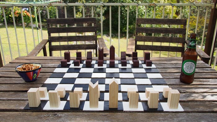
Kings and queens, distinct cuboids with their tops shaped into crowns, symbolize strategic prowess. Thus, this futuristic masterpiece transcends tradition with a mere 32 geometric sculptures. The chessboard becomes an artistic intersection of minimalist design and strategic play, navigating the timeless game through a refreshingly modern lens.
A Bare Bones Business Card
A minimalist business card stating an individual named Jake’s credentials is presented in this image. While the entire phrase “jake@jakefry.com” embraced by a large bracket cleverly marks as an email, the smaller bracket hovering over “@jakefry” subtly signals its Twitter association. At the top, a bracket crowns “jakefry.com,” designating it as the website.

Stripped of excess, the card breathes simplicity, delivering vital information with artistic restraint. Without wasting effort on needless details, this design encapsulates the essence of minimalism, where each element plays a purposeful role, proving that in the realm of design, eloquence lies in the careful omission of the unnecessary.
A Detergent Ad That’s Washed with Creativity
In a stroke of brilliance, this Ariel detergent ad presents the flags of Ireland and Italy side by side. At first glance, the flags seem almost identical, sharing the same shades of green, white, and red. However, upon closer inspection, the subtle variations in these colors become apparent.
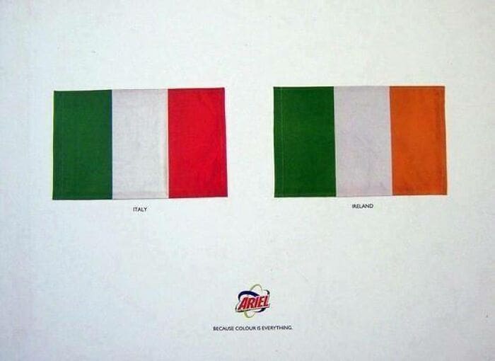
The tagline, “Because Color is Everything,” captures the essence of the ad, emphasizing Ariel’s commitment to preserving the vibrancy and integrity of colors. This clever juxtaposition highlights the detergent’s color-preserving prowess and serves as a visual celebration of the importance of even the subtlest hues in our everyday lives.
A Smart Minimal Poster for “Back To The Future”
A visual ode to temporal journeys unfolds in the background of the Back to the Future movie. A series of dots, each representing a pivotal moment, emerge and connect through delicate lines, concealing the complex narrative intricacies and encapsulating the essence of time travel.
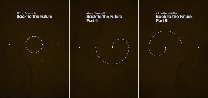
From the iconic DeLorean’s first jump in 1955 to the futuristic escapades in 2015 and the Wild West adventures in 1885, the connected dots narrate the cinematic journey across eras. This minimalist depiction becomes a captivating homage, showcasing the interconnected tapestry of the past, present, and future in the Back to the Future saga.
The Simple Beauty of Oregon
In the vast expanse of Oregon, an abandoned home stands alone amidst serene wheat fields, appearing as a poignant splotch of sadness. With a soft golden hue, the fields stretch endlessly beneath a pristine, clear blue sky. The stillness of the wheat imparts a tranquil atmosphere, undisturbed by the passage of time.

Meanwhile, the weathered exterior and empty windows of the desolate house echo a bygone era, contrasting with the vibrant life in the surrounding nature. Thus, this bright picture carries a melancholic undertone, portraying the beauty of abandonment against the backdrop of the untouched golden fields and the boundless sky.
In Tokyo, The Land of Minimalism
Nestled within the confines of Tokyo, this 6-foot-wide house asserts its presence with sleek subtlety. Squished between neighboring structures, its exterior design boasts a grey rectangular structure while its continuous black floor-to-ceiling windows, adorning the facade, form a monolithic yet elegant expanse of transparency.
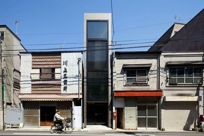
Although constrained by its metropolitan context, this architectural gem maximizes its minimalist aesthetic to create a sense of spaciousness and modernity. The house, a harmonious blend of form and function, is a testament to the ingenuity required to thrive in Tokyo’s tight urban tapestry, showcasing that simplicity can flourish within compact spaces.
Waveform Art, Redefined
This audio waveform wall art rendition of “Let It Be” by The Beatles is an elegant testament to the iconic melody. The waveform gracefully undulates across the canvas, translating the harmonies and lyrics into a dynamic visual symphony. Peaks and troughs represent musical intensity, forming a rhythmic dance that mirrors the song’s emotional cadence.
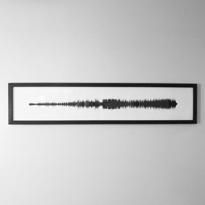
The choice of colors subtly echoes the album cover, capturing the song’s essence. This audio waveform wall art is not just a visual representation but a harmonious fusion of music and aesthetics, inviting viewers to connect with the timeless soundscape of “Let It Be.”
The Illusory Christmas Tree
Stringed from above, a captivating Christmas tree illusion unfolds here. Green Christmas balls are hung in precise arrangements so that they can craft a flawless silhouette of the festive tree. Thus, without using traditional foliage, this artful representation transforms the entire space with a beautiful holiday charm.
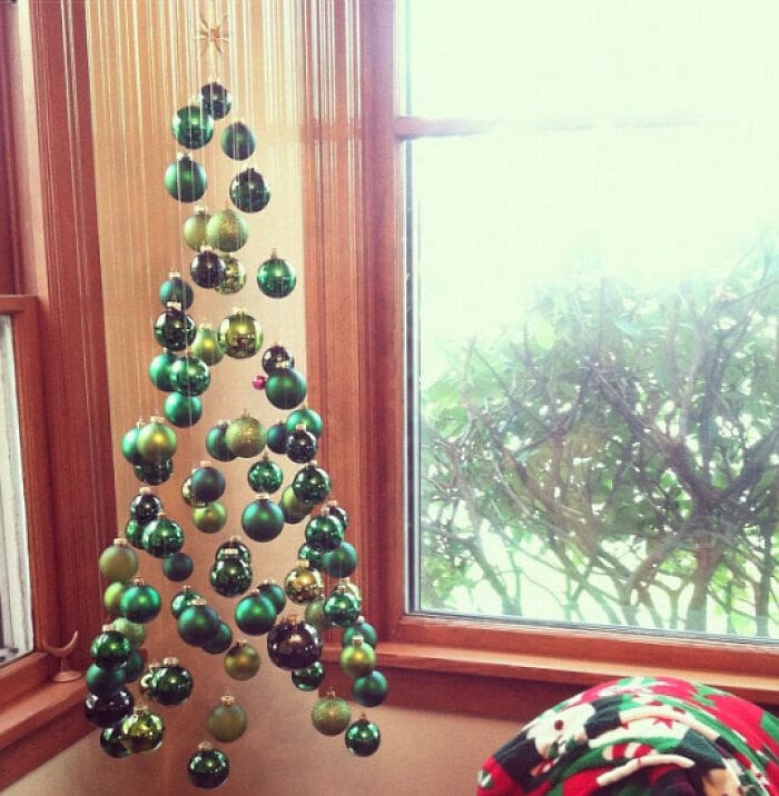
In their simplicity, the suspended spheres evoke the spirit of Christmas, showcasing the beauty that arises when less is skillfully fashioned into more. It breaks the traditional expectations of maximalist splendor associated with the festival. The Christmas balls dance in celebration, a testament to the elegance achievable through thoughtful design.
Food-Tastic Art!
Burger King’s minimalist free WiFi logo ingeniously merges connectivity and culinary identity. A subdued yet impactful design features the familiar network signal curves, each segment artfully colored. Beige, green, orange, maroon, and another touch of beige form a symbolic representation of a hamburger, while the curves are reminiscent of the layers in a burger.

This minimalistic masterpiece not only communicates the availability of free WiFi but also faintly incorporates Burger King’s distinctive color palette, blending technology with the unmistakable touch of the fast-food kingdom. A subtle nod to connectivity and cuisine, this logo seamlessly blends form and function.
Book Covers that Touch the Soul
A hardback book, “Living In Bali” or “Vivre À Bali,” unveils its essence as the intricately designed slipcover is gently removed. Underneath, a simple orange cover emerges, embodying the minimalist spirit. The book’s title is elegantly embossed, standing boldly against the warm hue.
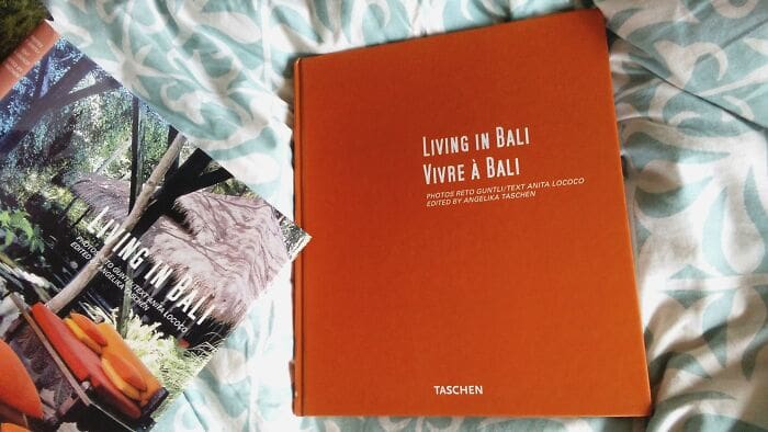
Below it lies the credits, discreetly placed, acknowledging the skilled hands behind the lens and the thoughtful minds guiding the book’s creation. Thus, this unadorned orange cover, a canvas of simplicity, belies the richness within, inviting readers to explore the enchanting world of Bali.
Space-Saving Shelf Design
In a quick glance, the first image showcases a cabinet of white shelves edged with vibrant yellow, purple, blue, red, and green hues. However, upon closer inspection, a clever revelation unfolds—the borders are not mere embellishments but slots. Clever, don’t you think?
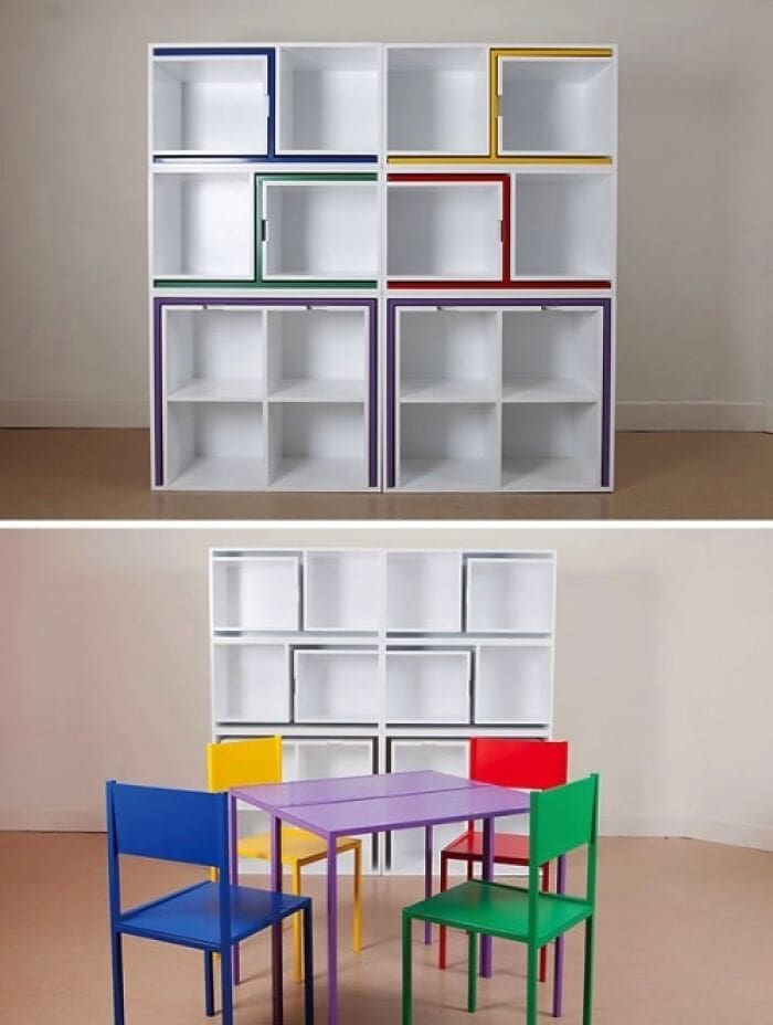
This marvel integrates form and utility, as each color-coded slot disguises a versatile seating solution. The white canvas serves as both storage and practical furniture, a testament to the art of hidden design within a minimalistic framework, where simplicity conceals multifunctionality in a visually arresting manner.
A Californian Bath Haven
Step into the serene bathroom/wet room of the Nakahouse in LA, where a vision of pristine white reigns supreme. The floor, bathtub, and cabinets blend into a monochromatic sanctuary, evoking a sense of purity and tranquility. The all-encompassing white palette transforms the space into a canvas of simplicity.
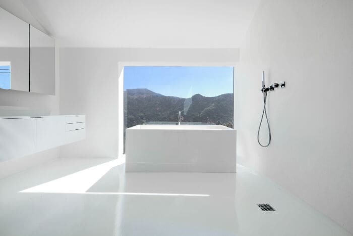
A floor-to-ceiling window becomes a portal to breathtaking views of the Californian hills. Allowing the soft glow of natural light to penetrate it further renders an ethereal ambiance to the space. The Nakahouse bathroom is a testament to the power of simplicity and the harmonious integration of interior and exterior elements.
Desert Desolation’s Beauty
In the desert region of the Ica city, a lone dune rises gracefully. Its golden contours, shaped by the whims of the wind, stand as a testament to the timeless dance between earth and air. Amidst the vast terrain, this one dune becomes a minimalist sculpture, its smooth curves capturing the play of light and shadow.

The untouched expanse around it accentuates the dune’s singularity, invoking a profound sense of solitude and serenity. Thus, in this desolated landscape, Ica’s desert unveils its quiet grandeur, where the simplicity of a single dune holds the essence of a boundless, tranquil wilderness.
Lessons of Minimalism at the Stuttgart Public Library
The Stuttgart Public Library stands as an architectural marvel, with its minimalist white design exuding an air of refined simplicity. Its exterior, adorned with clean lines and uniform windows, is a pristine canvas reflecting natural light. While on the inside, the library’s interior continues the theme of minimalism.
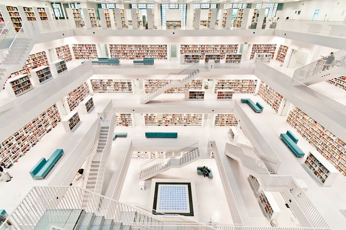
The strategic placement of unobtrusive stairs at precise intervals enhances the building’s aesthetic appeal and guides visitors with subtle grace. No wonder this contemporary masterpiece is a celebration of understated elegance! Every element of this library, from the facade to the interior, contributes to the overall sense of architectural brilliance and intellectual exploration.
Now that’s McGenius!
In the heart of Portugal, McDonald’s introduces a series of simple ads that speak to the soul of fast-food delight. Silhouette-colored drawings take center stage, capturing the essence of the beloved menu items. A French fry, crisped to perfection, stands tall with an inviting golden hue.
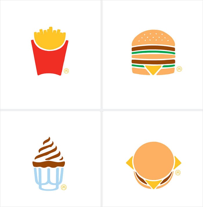
On the contrary, a burger, the epitome of savory satisfaction, is rendered in mouthwatering detail. Lastly, an ice cream cone, a sweet symphony, completes the trio with a swirl of delectable simplicity. Against a clean backdrop, these minimalist illustrations evoke a sense of immediate recognition and appetite appeal, creating a visual language that transcends linguistic barriers.
Minimalistic Architecture for the Win!
A striking feature emerges in this plain, sleek lobby—a distorted cone-shaped structure descends from the ceiling with a spiraling staircase inside. Seamlessly blending functionality with design, this structure looks geometrically unique and pleasing to the eyes. Indeed, it is a modest marvel in its simplicity.
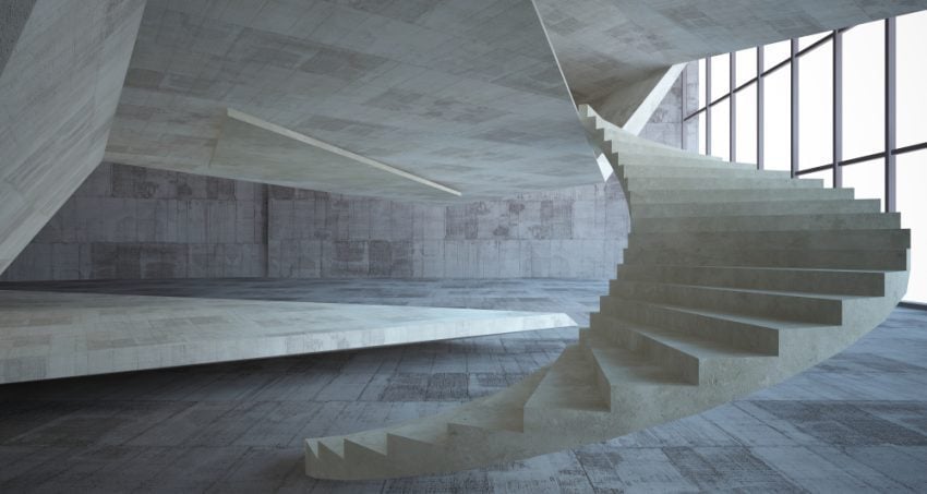
The clean lines and uncluttered space emphasize the purity of the architectural concept. The cone, put up like a suspended staircase, becomes a visual focal point, transforming the lobby into an aesthetic piece of art. This design transcends the ordinary, unfolding architectural brilliance with utmost minimalism.
A Deck of Cards Like No Other
In the realm of minimalism, a card deck unfolds with elegant simplicity. Four aces, each with a refined design, reveal the essence of this understated elegance. The letter “A,” representing the ace, is cleanly printed in either red or black, embodying the duality of the classic deck.
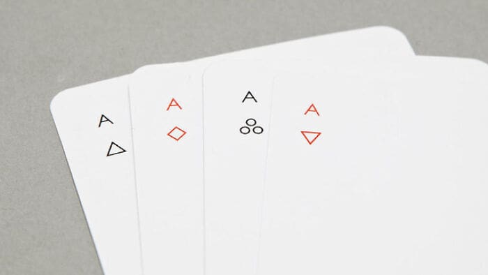
Meanwhile, the heart, spade, club, and diamond symbols mirror this restrained aesthetic, each rendered in the same color scheme. Thus, with unembellished lines and color choices, this minimalist card deck evidences the timeless allure of simplicity, where the essence of each card is distilled into its purest and most recognizable form.
The Beauty of the Norwegian Passport
The Norwegian passport epitomizes austerity in design. With clean lines and restrained elegance, it showcases a captivating aestheticism. While the cover is adorned with the national emblem and a subtle palette exuding sophistication, the inside contains essential information presented with clarity and devoid of unnecessary embellishments.
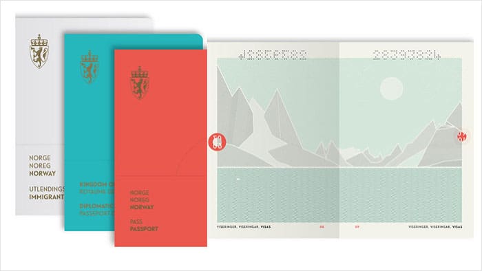
Each passport page is a canvas of simplicity, incorporating Nordic motifs and delicate details. The overall design highlights thoughtful minimalism, ensuring visual appeal and practical functionality. Thus, the Norwegian passport stands as a symbol of understated beauty, demonstrating how starkness can elevate a functional object into a work of art.
A Clean Calendar for an Organized Individual
Embrace the modesty of a minimal desk calendar, where elegance meets functionality on a single sheet of paper. At the top, a solitary number indicates the month—3 for March, embodying an unpretentious design. Below, the days and dates unfold in a neat and straightforward arrangement.
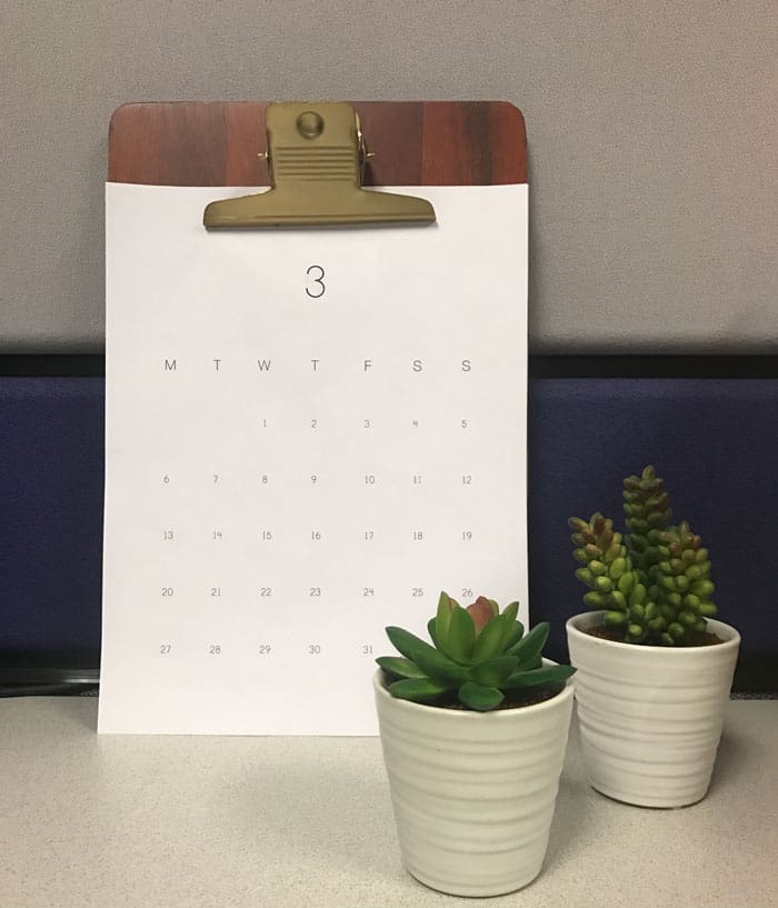
Clean lines and uncluttered spacing characterize this calendar, ensuring a quick, effortless grasp of the month’s schedule. This masterpiece transforms the ordinary desk calendar into a refined visual tool. The absence of unnecessary embellishments highlights clarity, making it a perfect companion for those who appreciate simplicity’s beauty in design and organization.
Clash of the Heros, But Minimally!
In this masterpiece, Batman and Superman stand poised for an epic clash. Rendered with stark simplicity, the two comic titans exude tension, ready for battle. Their iconic silhouettes, etched with bold lines, and their black and red capes, swirling around like a tornado, add dynamic energy to the composition.
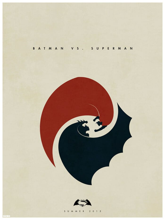
This striking poster captures the essence of the legendary face-off, distilling the brawl between the iconic superheroes into a visual spectacle. The carefully chosen elements emphasize the impending clash, showcasing the power of minimalism to convey the intensity of Batman versus Superman in a captivating and concise manner.
The Clever Olympics Insignia
The 1964 Tokyo Olympics poster is a masterclass in simplicity and symbolism. Against a white backdrop, the iconic red circle of the Japanese flag takes center stage. This poster is a timeless representation of the purity and universality of the Olympic Games.
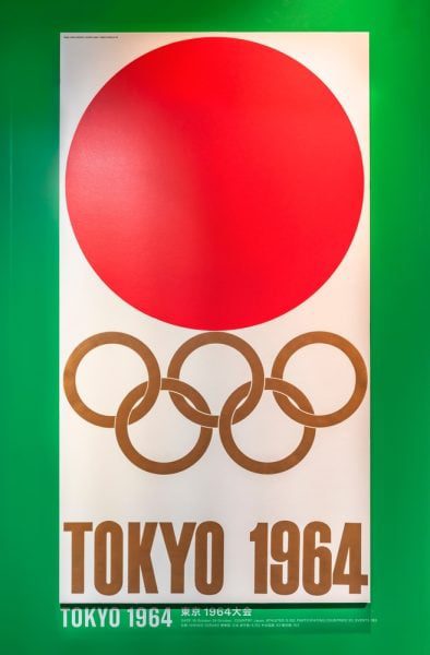
The minimalist composition, predominantly red and white, encapsulates the essence of both Japan and the Olympic spirit. The harmonious fusion of the national symbol with the global Olympic rings creates a visual narrative that resonates with unity, tradition, and the spirit of international collaboration.
A Frozen Oasis
Nature’s frozen alchemy turns a once vibrant swimming pool into a tranquil winter spectacle. With its edges delicately outlined, the pool becomes a beautiful canvas, creating an ethereal border between liquid and frozen realms. The diving board, adorned with a crisp layer of snow, stands as a stoic sculpture against the winter backdrop.

Each snowflake contributes to the pool’s metamorphosis, turning it into a serene, icy sanctuary. Thus, in this frost-kissed tableau, the intersection of summer’s memory and winter’s chill embodies a minimalist aesthetic, inviting contemplation amid the silent beauty of seasonal transformation.
Car Design Dripping With Class
Immerse yourself in the refined interior of a Volvo Car, where sophistication meets minimalist design. The sleek brown floating console effortlessly hovers within the dashboard. Its clean lines and muted brown tone evoke a sense of warmth and elegance. Black buttons dot the console, offering tactile functionality with a subtle contrast.

In this carefully curated interior, the sleek brown console becomes a visual centerpiece, embodying Volvo’s dedication to sophisticated design and functional beauty. The floating design not only enhances the sense of spaciousness but also represents Volvo’s commitment to blending luxury with simplicity.
Solitude of the Lonesome Tree
A desolated black silhouette pierces the emptiness of an expansive white canvas—it is a lone tree with branches reaching upward in stark isolation. Against the pristine backdrop, its forlorn posture becomes a poignant symbol of loneliness, perfectly capturing the essence of solitude.

Here, the tree, stripped of leaves and color, stands as a stark testament to the quiet isolation of nature. The absence of companionship echoes through the void, transforming the minimalist image into a visual metaphor for profound solitude that can exist in the simplest forms.
Let’s Bring Back Minimalist Packaging for Apple Juices
In the world of minimalist packaging, the Simply M&S Apple Juice carton design is an exemplar of simplicity. The front of the package features crisp black text, stating “Simply M&S Apple Juice, Est. 1884” and “Apple Juice from Concentrate.” Below these details, a modest illustration of an apple adds a touch of visual charm.
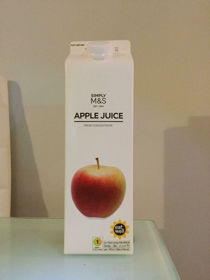
The choice of a single, timeless font against a clean white backdrop exudes understated elegance. This minimalist carton design not only conveys essential information in a straightforward manner but also captures the essence of authenticity. It refers to the brand’s establishment in 1884 with a nod to apple juice’s pure, natural flavor.
Thought-Provoking Minimalism
This image portrays a lone man with his silhouette contrasting against an endless expanse of merged yellow and dark grey hues. Rowing a boat, he moves through a tranquil canvas where the water and sky seamlessly unite, erasing the distinction between them.

The absence of a visible horizon amplifies the vastness, creating a minimalist portrayal of serenity. It invites contemplation amongst viewers, capturing the essence of solitude in a tranquil journey across an abstract backdrop and exuding a profound sense of peace.
The Best Lager Can Design You Could Think of!
In the world of minimalist beer can design, “And Union Unfiltered Lager” emerges with understated elegance. A pristine white serves as a clean canvas, adorned only with bold black letters spelling out the product name. The simplicity of the design mirrors the unfiltered purity of the lager within.
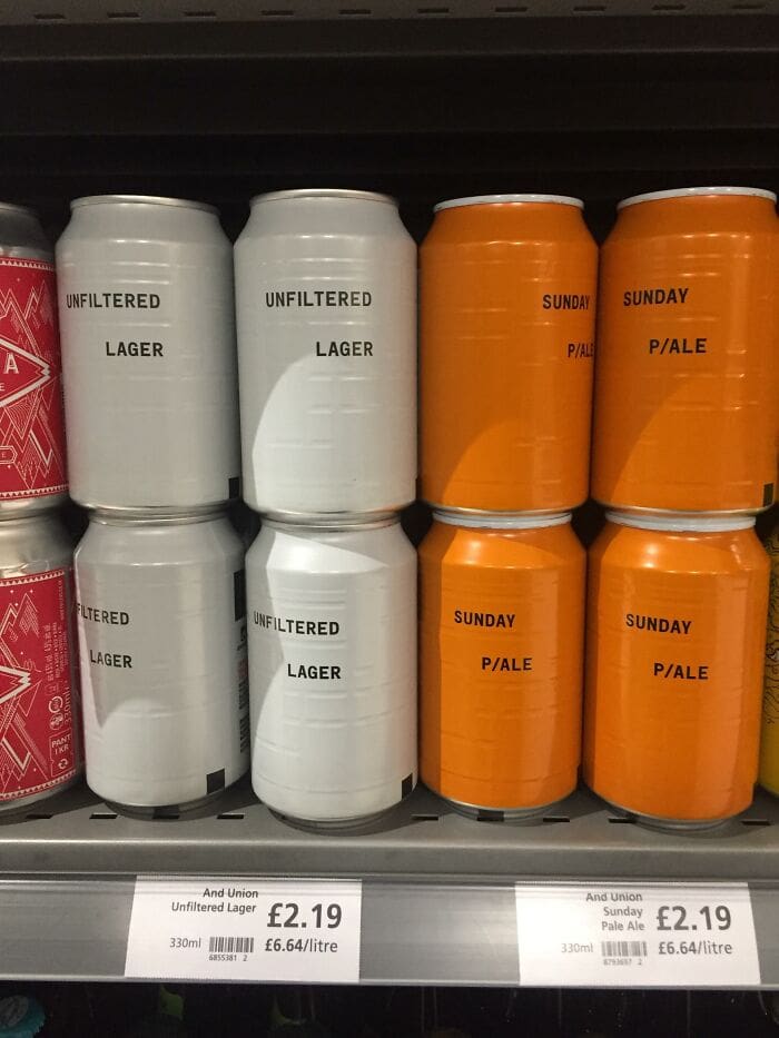
Meanwhile, “And Union Sunday Pale Ale” boasts a warm orange can as inviting as a lazy Sunday afternoon. The product name graces the can in black letters with a delightful twist—the words “Pale Ale” are seamlessly merged into “P/Ale.” This playful touch adds character to the packaging, capturing the essence of a laid-back Sunday.
Arctic Simplicity
The Unofficial Flag of the Arctic Ocean, a triumph from the r/Vexillology community, is a prime example of minimalist brilliance. A single white cube, cleverly inverted on its corners, transforms into a diamond shape dominating the flag’s canvas. With a serene light blue color, the upper half captures the boundless Arctic sky.

On the contrary, the lower half, which has a deeper blue hue, represents the ocean’s vastness. The simplicity of this design echoes the pristine purity of the Arctic landscape, where the sea and sky meld seamlessly. This winning flag is a visual ode to the Arctic, distilling its essence into an elegant and symbolic form.
The Cubic Clock 35
Behold the minimalist elegance of a cube-shaped clock bathed in a whitish hue. With utmost simplicity, its unadorned surface unveils only the essential—the digital numerics that showcase the time. The crisply displayed numbers seamlessly integrate into the monochromatic façade, creating a harmonious blend of form and function.

With its cubic silhouette, this clock becomes a sculptural timepiece, embodying the essence of understated design. The soft white color adds a touch of warmth, while the hidden numerals ensure that time is the focal point. Thus, the clock transforms timekeeping into an artful expression where clarity and simplicity converge strikingly.
Lake Trevallyn’s Enchanting Beauty
In the eerie stillness of Lake Trevallyn in Launceston, Tasmania, this photograph captures an otherworldly scene. Eight wooden poles rise mysteriously from the tranquil water, their reflections rendered on the lake’s surface. The water’s undisturbed calm transforms into an ethereal mirror, creating an illusion that these upright structures are floating in a boundless void.
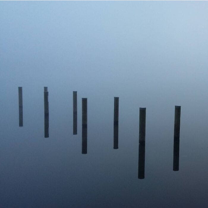
Both real and mirrored cylindrical forms pierce the placidity, casting an enigmatic spell over the otherwise silent expanse. This haunting image from Lake Trevallyn blurs the line between reality and reflection, leaving an indelible impression of solitude and spectral beauty.
Domino’s Pizza Box Design that Won People’s Hearts
Travel back to the 90s with a basic Domino’s Pizza box design. Adorned in beige, the box reflects the era’s understated charm. A wide orange rectangle dominates the frame, its bold austerity making a statement. Meanwhile, the lighter beige circle at the center of this vibrant rectangle adds a touch of visual interest.
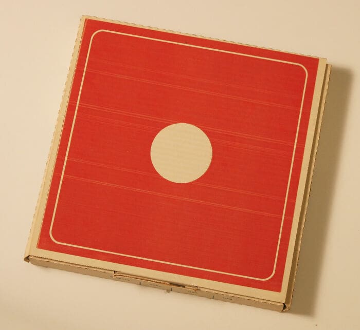
With its earthy tones and geometric elements, this minimalist design encapsulates the essence of a bygone era, embodying the straightforward and timeless appeal of enjoying a delicious Domino’s Pizza. It’s a nostalgic nod to the simplicity that made pizza nights memorable in the 90s.
The Miniscule Elephant
In a sweeping landscape, an elephant stands solitary amidst a vast sea of green grass. The distance between the lens and the majestic creature diminishes its scale against the expansive sky, imparting a poignant perspective. The colossal mammal, reduced to a minuscule figure, underscores the enormity of the world.
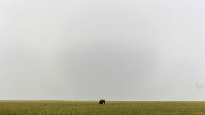
Also, the towering grass engulfing the elephant emphasizes nature’s grandeur. Thus, this cinematic tableau beautifully showcases the immensity of our planet, humbling even the mighty. Here, the lone elephant becomes a visual metaphor, reminding us that even the grandest can appear insignificant within the boundless expanse.
An Ingenious Simpsons Tattoo
A masterpiece unfolds in the form of a chainsaw-shaped Simpsons family tattoo. The chainsaw’s contours ingeniously house the black-inked outlines of Homer, Marge, Bart, Lisa, and Maggie. Each family member is distinguishable by their iconic hairstyles, encapsulated within the sleek design.
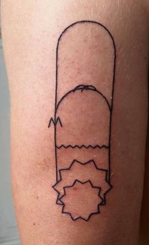
Homer’s bald crown, Marge’s distinctive beehive, Bart’s spiky rebellion, and Lisa and Maggie’s sun-shaped hair—all are delicately etched in minimalism. The tattoo not only pays homage to the beloved cartoon but merges the essence of each character into a unified, artful representation.
A Simple Ode to Camaraderie
In the realm of minimalistic brilliance, a F.R.I.E.N.D.S. tattoo emerges as a subtle yet unmistakable tribute to the iconic TV show. Devoid of letters, it solely relies on the colored periods that punctuate each letter. This is pure genius, don’t you think?
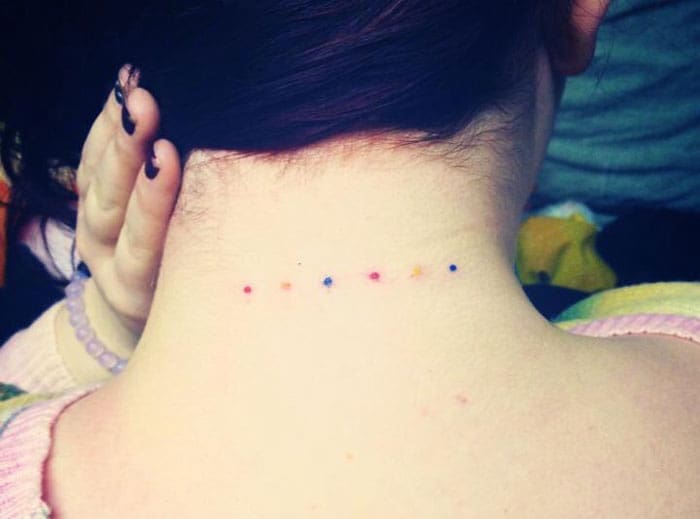
These simple dots, strategically placed, form a rhythmic pattern that instantly recalls the signature color palette of the F.R.I.E.N.D.S. logo. With a nod to the vibrant circles, each representing a character, this minimalist masterpiece becomes a visual symphony, encapsulating the essence of friendship that defines the beloved series.
A Scene of Snowy Simplicity in Norway
In the vast Norwegian wilderness, a minimalist tableau unfolds as hikers traverse a snow-covered hillside. The strategic zigzag route in which they walk, reminiscent of ants on a sheet of paper, minimizes the slope of their ascent. The distant shot amplifies their diminutive figures against the expansive snowy canvas.

Thus, against the serene backdrop, the hikers become tiny wanderers, navigating nature’s magnitude. With deliberate steps marked by a rhythmic movement on the white landscape, they embody the harmonious blend of simplicity and purpose in the wintry landscape of Norway.